Whether you’re pitching a business proposal or showcasing a product, your ability to present information clearly and persuasively is crucial in capturing and maintaining your audience’s attention. You can read numerous articles or learn techniques from well-known orators, but nothing compares to solid evidence. If you aim to enhance your presentation skills, you need to rely on concrete numbers which prove that certain performance tricks really work, and apply them in your next presentations. In this article, we’ve gathered some important statistics that will greatly help you understand the art of giving presentations.

Oral Presentations Can Make You More Successful

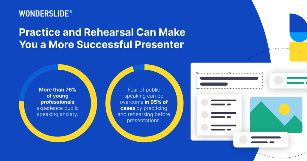
A recent study published in the International Journal of Scientific Engineering and Applied Science shows that more than 76% of young professionals experience public speaking anxiety. But more importantly, those who avoid speaking publicly miss numerous opportunities, from landing their dream job to receiving promotions within their current roles. The good news is that another study proves that the fear of public speaking is a learned behavior and can be overcome through practicing and rehearsing before presentations in 95% of cases.
The Power of Visuals

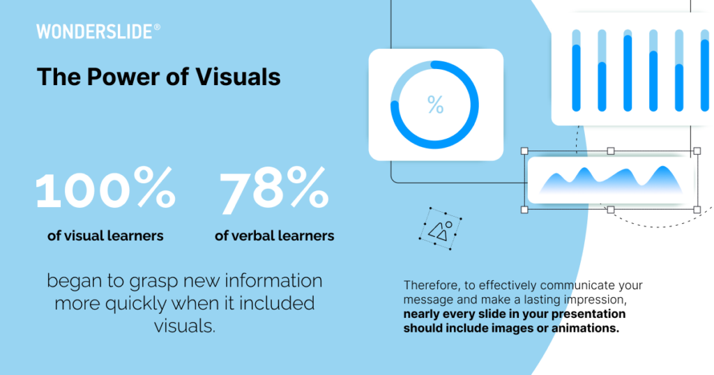
The study, “Classification of Visual and Non-visual Learners,” has provided valuable insights into the efficacy of visual aids in educational settings. A year-long research conducted in 2019 found that 100% of visual learners and 78% of verbal learners began to grasp new information more quickly when it included visuals. Even though the study proves the amazing ability of our brains to adapt to various teaching techniques, new verbal material proved to have limited benefits for visual learners. Therefore, to effectively communicate your message and make a lasting impression, nearly every slide in your presentation should include images or graphics.
Keep Up with Your Audience Attention Span

Microsoft Canada research revealed that the human attention span has shrunk to just 8 seconds, indicating a nearly 13% decrease in just one year. This doesn’t necessarily mean that people are unwilling to learn new information or focus on new material; rather, it reflects that consumers have an abundance of choices and need more compelling and strong reasons to retain new information each year.
Our top tips based on these statistics are straightforward—keep your messaging clear, focus on simple design, keep your content brief yet impactful, and engage the audience by telling stories. If you’re looking to improve your presentation skills, read our data-driven guide to crafting effective and engaging slides.
Benefits of Silent Mode

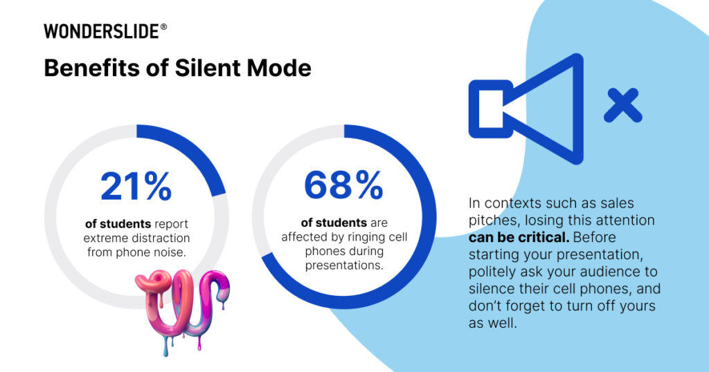
The Pakistan Journal of Medical Sciences study proved that technology remains the most annoying external factor during presentations. Research among students of various ages showed that ringing cell phones were the most common distraction, affecting 68% of students, with 21% reporting extreme distraction from this noise. Worse still, participants found it difficult to refocus on the lecture material. In contexts such as sales pitches, losing this attention can be critical. Before starting your presentation, politely ask your audience to silence their cell phones, and don’t forget to turn off yours as well.
The Beauty of AI

According to recent HubSpot statistics, the average employee now saves 2.5 hours per day by using AI tools. Moreover, 71% of business leaders see a positive ROI of their investment in AI automation tools and 72% say it makes their workers more productive.
A variety of new applications, including Wonderslide, serve your different needs and, of course, might assist you with creating presentations. AI is helpful in writing text for slides or speeches, generating illustrations, brainstorming ideas, and even creating designs. This new technology not just saves time—it also inspires you and offers new perspectives on your concepts.
The Poor Design and Wording are Still a Problem

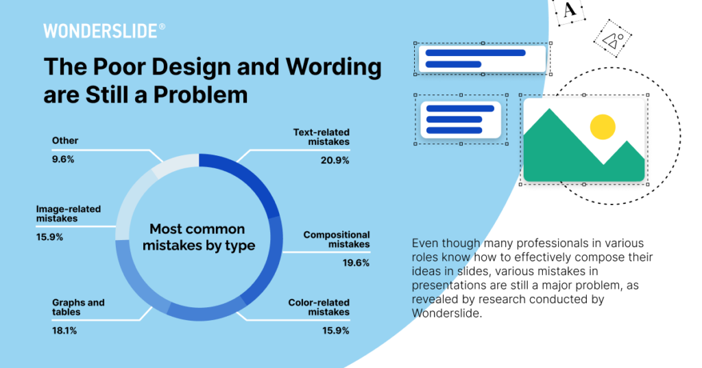
Even though many professionals in various roles know how to effectively compose their ideas in slides, various mistakes in presentations are still a major problem, as revealed by Wonderslide research.
During the research, a group of graphic design professionals that have collectively taught over 50,000 people how to design presentations shared their insights on presentation design mistakes. Of the problems reported, 20.9% were text-related mistakes, including overloading slides with text, using small font sizes or conflicting fonts. Additionally, experts highlighted sloppy alignment of elements, improper placement of tables and graphs, and the presence of excessive elements on a single slide, which accounted for 19.6% of issues. Further analysis revealed problems such as inappropriate graph types, poorly designed graphs and tables (18.1%), and the use of low-quality images (15.9%). Notably, color-related mistakes, including the use of excessive colors and outdated gradient color schemes, accounted for another 15.9% of reported issues.
Remembering these stats when you craft your next presentation can enhance how you communicate with your audience. While these pointers are useful during your slide show, the most effective way to boost your public speaking skills is by preparing your presentation well ahead of time and practicing it thoroughly. Make sure to plan the structure of your performance and be mindful of your audience.