This article is part of a larger research project that was aimed at discovering the main difficulties users face when creating presentations. Learn how to take advantage of all the data laid out in this article by reading part 2. You can also test your slide designing skills using Wondercheck, our new custom GPT.
In conducting this research, we have interviewed a group of graphic design professionals that have collectively taught over 50,000 people how to design presentations. The questions we asked them were designed (no pun intended) to get a clear picture of the most common mistakes people commit when creating their presentations, regardless of the software they use or their professional background.
We then tried to break each of these mistakes down into separate categories, giving you an in-depth overview of the potential pitfalls you might face during the design process.
Most common mistakes by type
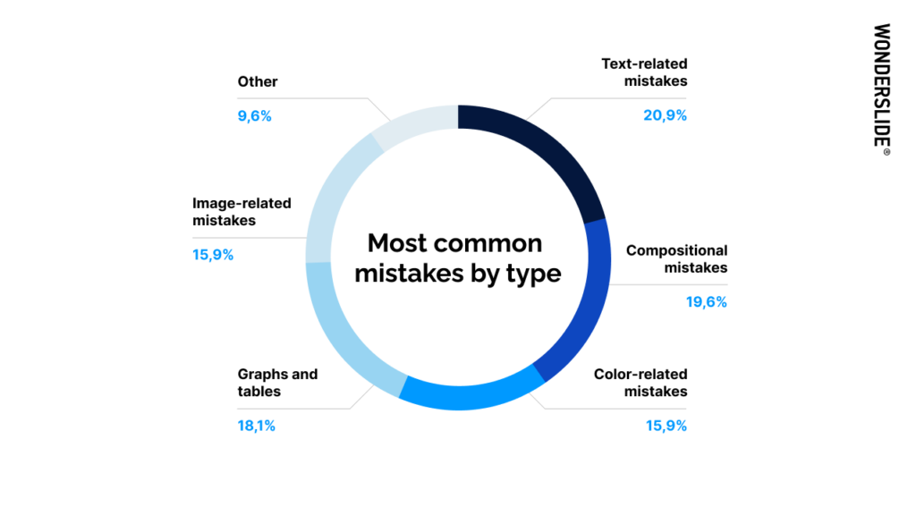
According to the experts we interviewed, here is the breakdown of the most common mistakes users make when designing slides. They are, in descending order:
- Text-related mistakes
- Compositional mistakes
- Graphs and tables
- Color-related mistakes (tied with 5)
- Image-related mistakes (tied with 4)
Let’s dive deeper into each category to uncover the specific mistakes users make.
Text-related mistakes
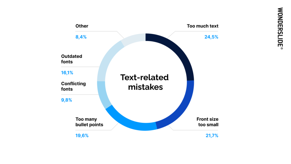
As we see here, the most common text-related mistakes are:
- Using too much text on the slide
- Using a font size that is too small to be legible
- Overloading the slide with bullet points
- Using outdated fonts
- Using visually conflicting fonts on the same slide


Compositional mistakes
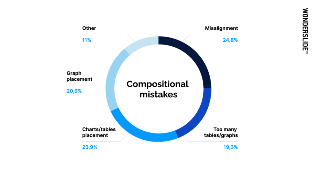
When it comes to compositional mistakes, the most common ones people make are as follows:
- Sloppy alignment of elements on the slide
- Improper placement of tables or charts
- Improper placement of graphs
- Using too many tables or graphs on the same slide


Graphs and tables
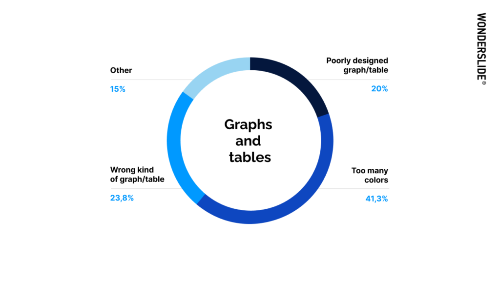
As we can see, the most common mistakes when using graphs or tables are:
- Using too many colors, especially to highlight various data
- Selecting the wrong kind of graph or table to illustrate and present your data
- Choosing a poorly designed graph or table


Image-related mistakes
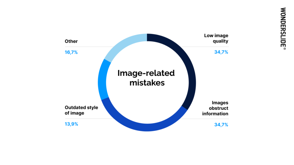
Here are the most common image-related mistakes in descending order:
- Using low-quality, low-resolution images
- Having images obstruct important information or data
- Using images that have an outdated style


Color-related mistakes
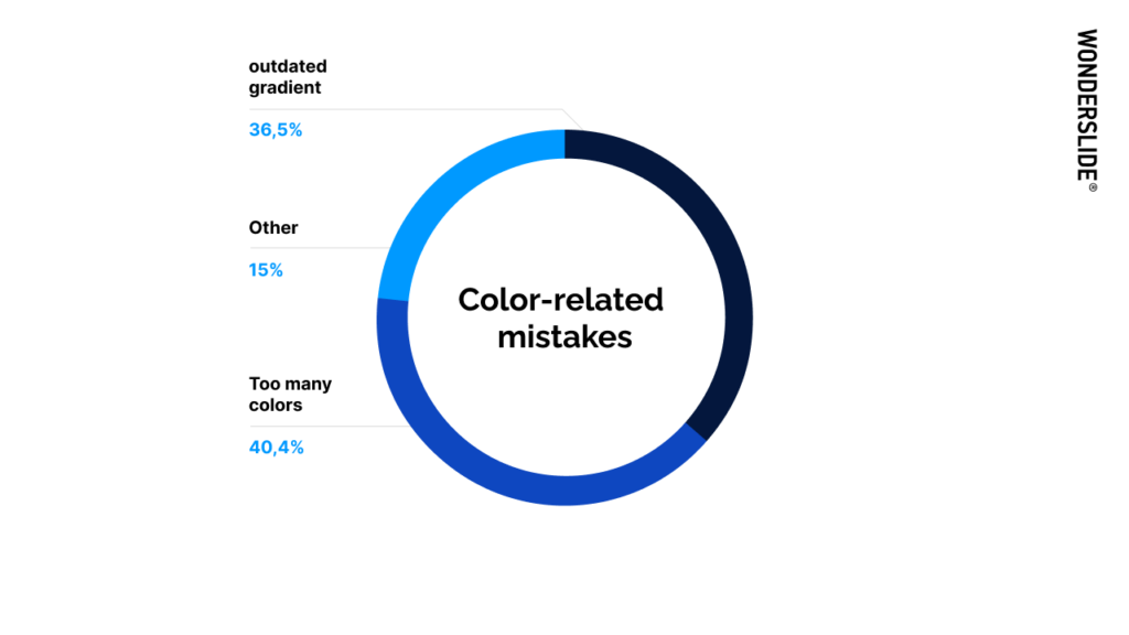
Color-related mistakes are somewhat simpler than the other categories, with only a few mistakes realistically possible. However, here they are in descending order:
- Using too many colors on one slide
- Using an old-school, outdated gradient color scheme


Now we know the most common mistakes that occur when creating presentations — but what next? First, you can test out your design know-how with Wondercheck – a new custom GPT we designed based on this very research. It will analyze your slide and give you thorough feedback on how you can improve it, and it will also point out any of the mistakes that we discussed above.
But we’ve still got more to learn. Let us now dive deeper into how we can preemptively avoid all the aforementioned mistakes, as well as some best practices – as suggested by our design experts. Armed with this kind of knowledge, you’ll be well on your way to leveling up your slides.