Grid presentation template
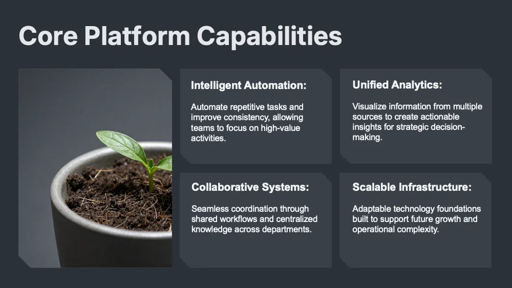
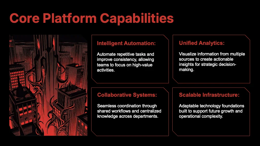
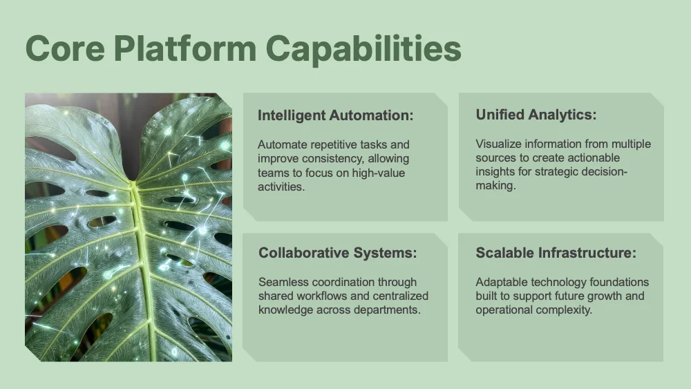
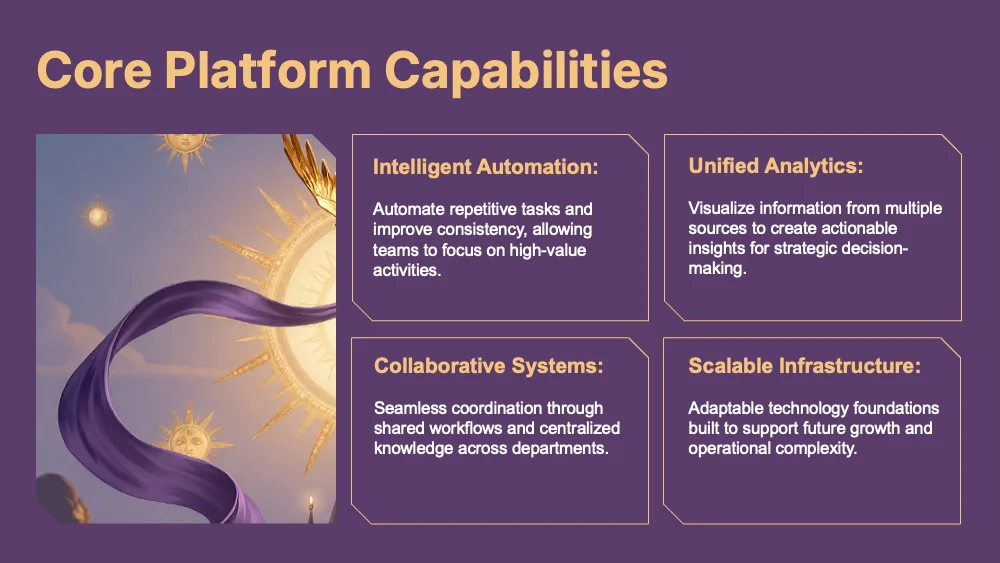
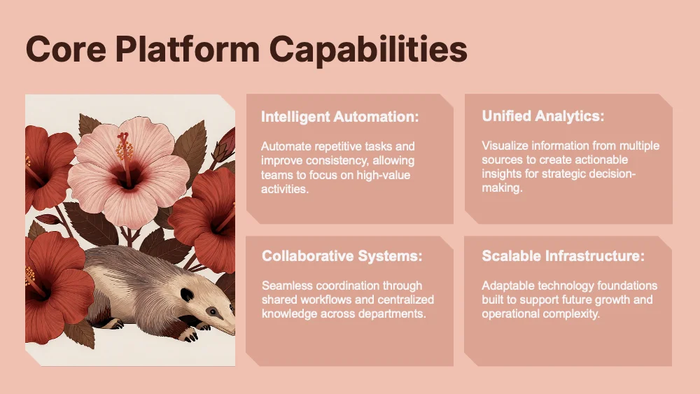
A modular style built on a grid of panels with clipped corners, where hierarchy comes from size and weight rather than decoration. Colors and fonts adapt to your brand, so one modular structure suits reports, KPI reviews and strategy decks.
Upload your PowerPoint or PDF and get it rebuilt in this style, with your content kept intact. Or describe a topic and start a new deck.
Use this style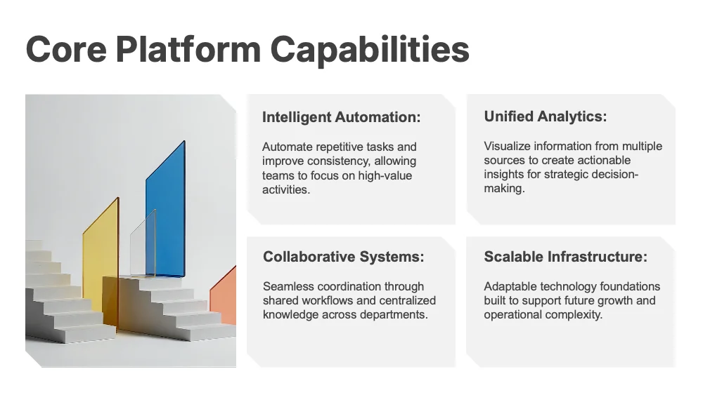
🖼️ Slides in this style
About this style
Grid is defined by structure, not by palette. Content lives on flat panels, each with a single clipped corner at the top right or bottom left, aligned in strict rows and columns with equal gutters. Hierarchy comes from size, weight and spacing alone: oversized numerals, bold headings and compact captions. Typical layouts include a KPI board with large figures beside a bar chart, two-by-two capability panels, a photo paired with one big statistic, a team slide with portrait tiles, and a hub diagram where outlined icon panels connect to a central block. A cover can pair a tall photo tile with the title, and a bottom-aligned statement slide leaves the upper half empty. Typefaces and colors are not fixed: they come from the user’s brand or theme, while the forms stay constant. The style suits results reports, KPI reviews, strategy and research decks and client updates. It handles figures, concise text blocks and architectural photography well. It is less suited to playful topics and long paragraphs.
Questions and 💬 answers
Does Grid keep its look when colors and fonts change?
Yes. The look comes from the clipped corners, strict alignment and equal gutters, none of which depend on a palette or a typeface. Any brand colors or font family can be applied, and every slide still reads as one orderly, modular system.
Is Grid good for KPI and results reports?
Yes. The board layout gives each figure its own panel with a large numeral and a short caption, and the chart sits in the same grid. Equal panel sizes and aligned edges let readers compare indicators at a glance, and every metric carries the same visual weight.
Does Grid work for a team introduction?
Yes. The team layout sets portrait tiles side by side with a name, role and short description beneath each one, all sharing the same clipped-corner frame. The equal tiles give every person the same visual weight and make the whole team look unified.
✨ Similar styles

Vector
A precision style built on tiles with a single clipped corner, tidy grids and thin-line icons. Colors and fonts adapt to your brand, so one engineered structure suits product, data and process presentations.
- Pitch deck
- Business report
- Research
Simple
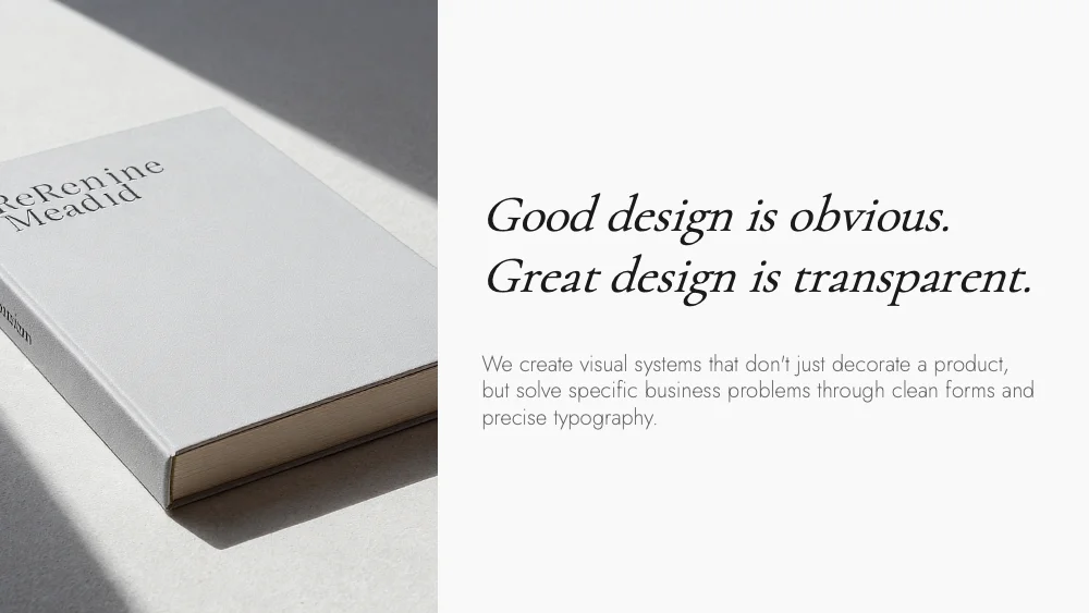
A pure typography style with no cards, frames or decorative shapes. Content sits directly on the background, and hierarchy comes from size, weight and space. Colors and fonts adapt to your brand, so it suits reports, lectures and research.
- Business report
- Lecture
- Research

Stone Minimal
A matte charcoal style with slightly lighter panels, clipped corners and soft grey type, with no accent color at all. Built for results reports, KPI reviews and strategy decks that need a sober, composed look.
- Pitch deck
- Business report
- Research
Give your slides a new look
Try it for freeGridUse this style