Simple presentation template
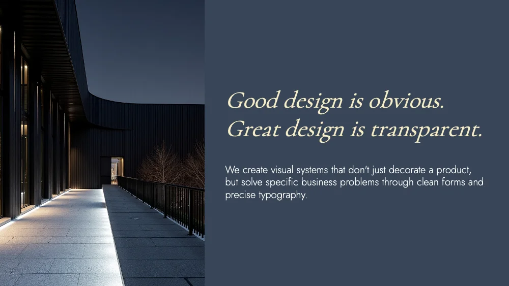
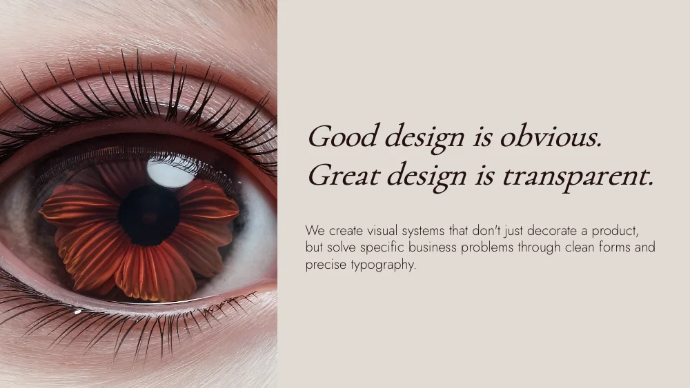
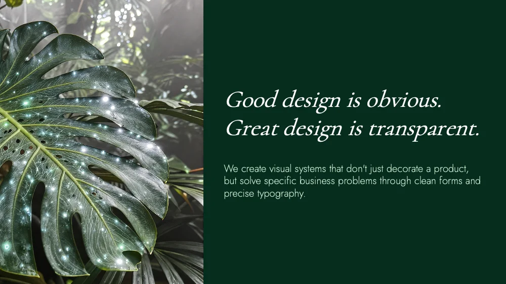
A pure typography style with no cards, frames or decorative shapes. Content sits directly on the background, and hierarchy comes from size, weight and space. Colors and fonts adapt to your brand, so it suits reports, lectures and research.
Upload your PowerPoint or PDF and get it rebuilt in this style, with your content kept intact. Or describe a topic and start a new deck.
Use this style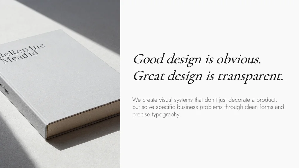
🖼️ Slides in this style

About this style
Simple is defined by what it leaves out. There are no cards, plates, frames or decorative shapes: text sits directly on an empty background, and structure comes from alignment, scale and white space alone. Headlines are large and left-aligned, body text is set in narrow columns with open line spacing, and large numerals mark sections and steps. Lists run in two or three plain columns, comparisons are two text columns side by side, and a statistic is simply one oversized figure with a short caption. Photos appear as clean rectangles, full-bleed or inset with generous margins, with captions beneath. Quotes are centered with a lot of empty space around them. Typefaces and colors are not fixed: they come from the user’s brand or theme. The style suits business and research reports, lectures, academic talks and long, text-led decks. It handles paragraphs, numbered lists, figures and photography well. It is less suited to slides that rely on icons, diagrams or visual containers.
Questions and 💬 answers
Does Simple keep its look when colors and fonts change?
Yes. The look comes from white space, alignment and scale, none of which depend on a palette or a typeface. Any brand colors and fonts can be applied, and every slide still reads as one calm, consistent system with the text as its only visual element.
Does Simple work for a long, text-heavy report?
Yes. With no cards or frames taking up space, the full slide is available for text, so paragraphs, numbered lists and figures fit comfortably. Narrow columns and open line spacing keep long material easy to read, and consistent alignment makes a 30-slide deck feel orderly from the first slide to the last.
Is Simple suitable for lectures and academic talks?
Yes. The empty background keeps attention on the speaker’s words, and large headings with short numbered points make each idea easy to follow. Photos and figures appear as clean rectangles with captions, so images and data look like part of a well-edited article, which suits academic and educational settings.
✨ Similar styles
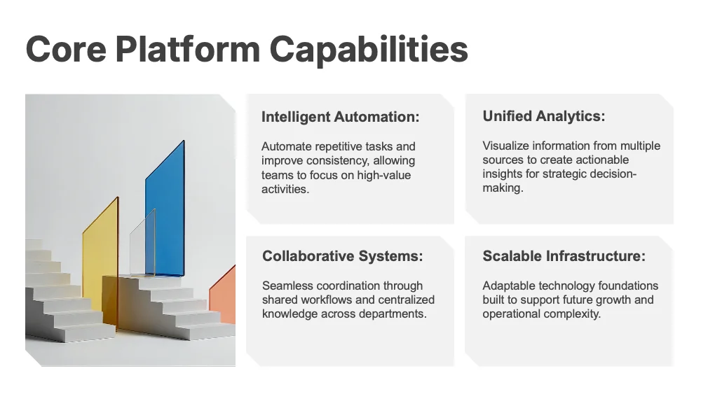
Grid
A modular style built on a grid of panels with clipped corners, where hierarchy comes from size and weight rather than decoration. Colors and fonts adapt to your brand, so one modular structure suits reports, KPI reviews and strategy decks.
- Pitch deck
- Business report
- Research
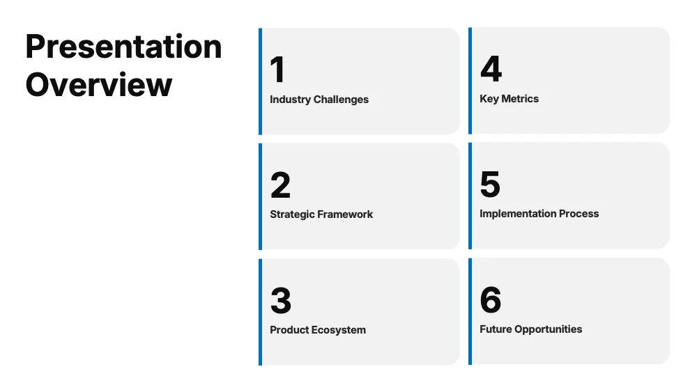
Flow
A soft-shape style built on rounded cards with a slim accent bar along one edge and generous padding. Colors and fonts adapt to your brand, so one calm structure suits reports, proposals and client presentations.
- Pitch deck
- Business report
- Marketing
Give your slides a new look
Try it for freeSimpleUse this style