Close your eyes and think of a PowerPoint presentation (not the most exciting image, I know). What’s the format that pops up — portrait or landscape? I’m willing to bet that it was likely the latter. And that would be fair — for the most part, presentations that we see in our work lives are, indeed, in landscape. Vertical presentations, however, remain a mystery – even to many professional graphic designers.
As some of you may know, we recently did some digging into the most common mistakes in presentation design (and in case you missed it: you can check out our research here). When writing it, something curious occurred to us: there are barely any guides online that even mention vertical presentations, much less go into detail about them.
But there’s a case to be made for putting more time into studying vertical presentations. After all, the world is increasingly going mobile. Last year, mobile devices (excluding tablets) accounted for 58.67% of mobile website traffic, and growing. And, well, vertical presentations are tailor-made for modern smartphone screens, which only seem to be getting bigger with each passing update cycle.
Why Go Vertical?
The main reason for choosing the vertical format over the more traditional horizontal one is simple: smartphone screens are used in portrait mode, so if you’re building a presentation to be viewed primarily on mobile devices, the vertical format seems an obvious choice. Not all presentations can be shared in-person, using a big screen or a projector — in the current fast-paced business environment, and especially with the growing prevalence of remote work, consuming presentations on the go is becoming a much more common practice than before.
Let’s say you’re sending a pitch to a client in the form of a vertical presentation. They might look at it during lunch, on their way to the office, or right before boarding a flight – and providing them a native mobile viewing experience is, at the very least, a nice gesture of professional courtesy. At the most, it could be the difference between landing that client or getting left in the dust. Details matter.
There are other advantages to the vertical format, like enhanced storytelling potential. The vertical orientation lends itself well to storytelling, allowing presenters to guide audiences through a narrative journey literally from top to bottom. It also encourages a more linear flow of information, enabling you to build compelling narratives and convey complex ideas with ease and clarity.
Another big reason to go with the vertical layout is social media compatibility. With the largest social media platforms, like Instagram and TikTok, heavily favoring portrait content formats, vertical presentations offer a natural fit for sharing and promotion. This allows you to repurpose your slides for social media, maximizing visibility and engagement across various channels.
Making a Vertical Presentation
Now, let’s take a closer look at each element of a typical presentation, and learn how we can adapt it to take full advantage of the vertical format.
Title page
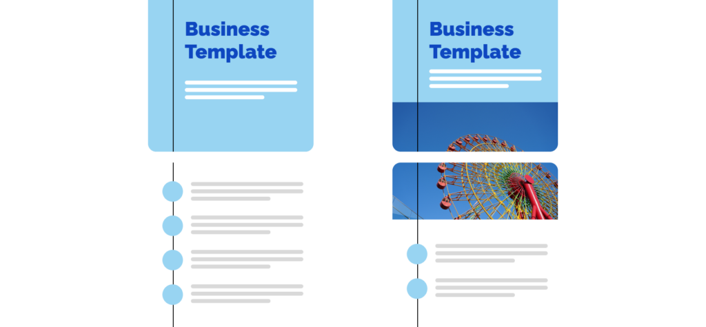
Employing the vertical layout doesn’t mean that your title has to look smaller and less impactful. A common design practice is actually making your title vertical by simply flipping it, as shown in the illustration below. Always strive to make your title page as visually appealing as possible – it will go a long way in engaging your potential audience.


Text & images
While using too much text is a common mistake when designing presentations, the vertical orientation lends itself well to increasing your slide’s text capacity. Reading in portrait is simply more intuitive, so don’t hesitate to take full advantage of that. However, keep in mind: using too much text on one slide is almost never a good thing, regardless of orientation. Try to keep things lean, if possible.
As for images and other visual elements, try using square or vertical formats as much as possible — that will ensure less empty space on your slides. While negative space can be useful, generally you want to keep vertical presentations as visually rich and engaging as possible.
Background
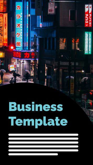
Using background images on slides is a hot topic among graphic designers – some are generally OK with it, while some call it a cardinal sin. Regardless, if you plan on using background images (at least on the title page), make sure they’re always in portrait. To make the text more easily legible, choose bold, contrasting colors. You can also place a visual element, like a shape, underneath the text, but in front of the background, to make the text pop even more.


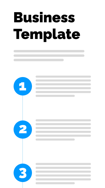
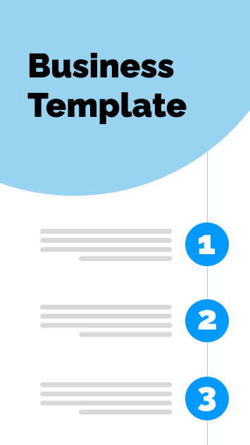
Subheadings & lists
Similar to long bits of text, the vertical layout is ideal for longer lists, be it numbered lists or bullets. However, try to keep your points short and sweet, as you will now be more limited in terms of horizontal space. Concise, yet impactful bullets are the name of the game when it comes to vertical presentations.

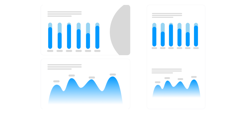
Graphs & Data
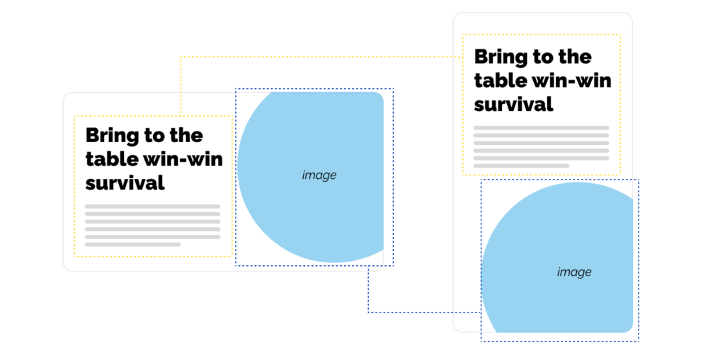
Due to the aforementioned horizontal space limitations, charts, graphs and tables can be quite tricky to get right. You can rectify that by placing two charts that would normally be on two separate slides on a single slide. As we see in the example below, no important information was lost.
Bonus tip: vertical connections
Take further advantage of the vertical format with this clever design trick. Align the graphic elements on consecutive slides in such a way that they seamlessly morph into each other. Even something as simple as a thin line running through multiple slides will add visual cohesiveness and flair to your presentation.
Final Thoughts
Before we conclude this short guide, there’s one more thing to keep in mind: while vertical presentations have some key differences that set them apart from traditional presentations — by and large, they are the same. Therefore, most principles that apply to landscape will also apply to portrait, and vice versa.
So, if you still haven’t, make sure to check out our comprehensive, data-driven guide to crafting more effective slides. It will take your presentation game to the next level, regardless of format.
And if this guide was of any help to you, feel free to share it with your friends or colleagues – they might find it helpful too! And don’t forget stay tuned for more cool and useful guides coming your way.