At Wonderslide, we believe that creating a beautiful and engaging presentation is an art that combines aesthetics and effective communication. Be it a business meeting, a conference, a classroom or a virtual presentation, the visual appeal of the slides can significantly impact your audience! Here is a complete guide to crafting a presentation that is both compelling and clear.
Know Your Audience
We usually start our presentation checklists with this paragraph because it is crucial and never hurts to repeat. By considering what your audience might find interesting, what they might already know, and what their expectations may be, you can tailor the presentation content and design accordingly. It’s important to understand that information should be delivered differently to various groups of people. Some may be visual learners, preferring more images to express ideas, while others may be more analytical, who benefit from graphics and studies. Some might prefer a more relaxed design with playful fonts, while others may appreciate a formal style.
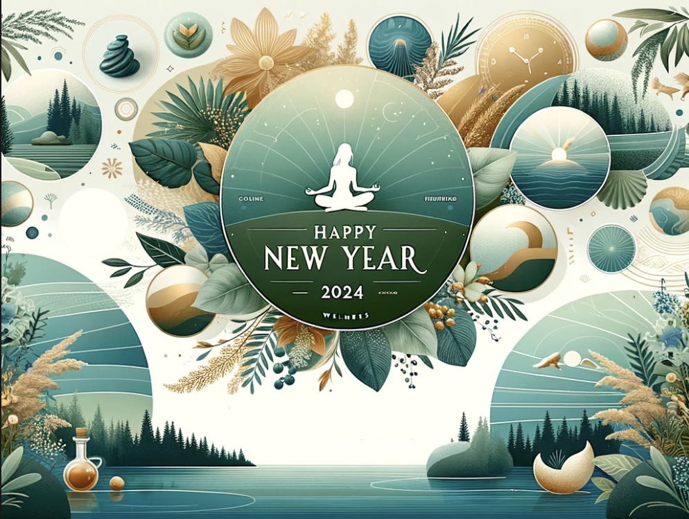
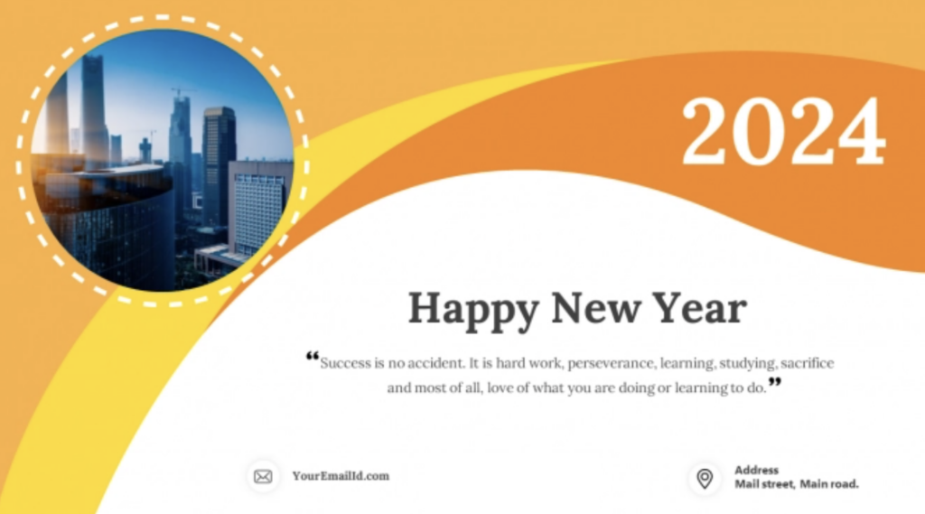
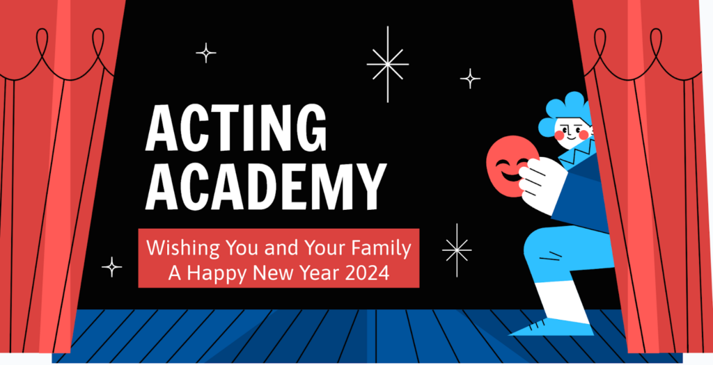
Examples of slides with New Year wishes for a wellness event, university students, an acting school, and a business meeting.

Choose a Common Theme
A common theme makes your presentation look and feel united. All the slides should have the same colors, fonts, and layout to make it look professional and easy to follow. Choose elements that are suitable for the topic and the mood you want to bring.
Use High-Quality Images
In order to get your message through and add to the overall appeal, you need high-quality images and graphics. Avoid cluttering slides with low-resolution photos. Instead, turn to tools like Unsplash or Canva, which feature a big high-res library of photos and graphics, to make your slides stand out. Don’t hesitate to use your own visual content or create some using AI tools, just ensure that they align with the overall theme. For more insights, check out our article on how to select good presentation photos.
Use Color Wisely
Color can enhance emotion and highlight important points, but overuse of it can distract or even confuse your audience. If you’re using a template avoid playing around with the shades and tints as it might ruin the overall look. If starting from scratch, choose a color scheme on the web and stick to it. Always make sure there’s a good contrast between the background and text for easy reading. Find out how to choose a color scheme for your presentation here.
Typography
Typography is important both in making your presentation readable and beautiful. Do not use more than 2 or 3 types of fonts to maintain consistency. Use bold or italics effectively with a reason and use large text that can be seen clearly from the back of the room. Learn how to design your text not only for visual appeal but also to deliver main ideas through it here.
Practice Minimalism
Especially for those new to presentation creation, we recommend a minimalist design approach. It not only makes your slides look modern and elegant but also focuses your audience’s attention on the main points, reducing distractions. Leave ample space on each slide, use simple layouts, and keep text to a minimum. With this approach to a design, you can also focus on the content of your presentation and your performance, which is more important for the audience than your design skills.
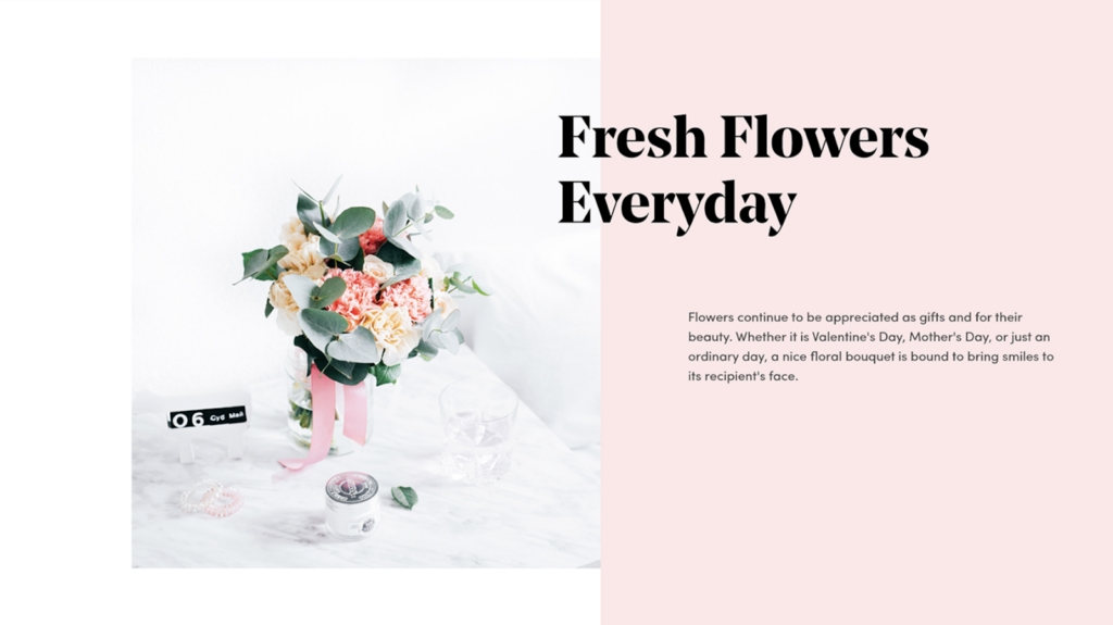
Example of a presentation for a flower delivery service in a minimalist style.
Multimedia Interaction
Incorporating videos, animations, and sound clips can make your presentation more dynamic. However, don’t overuse multimedia and make sure that it supports your message. Pay attention to video clip previews; they shouldn’t display blurry or unpleasant images.
Great reason to use video in this dance school presentation, but the preview makes the slide look messy.

A beautiful and appealing presentation design does more than just please the eye; it enhances communication and engagement with your audience. The slides’ appearance reflects the speaker’s vision and taste. Moreover, if you decide to send the presentation to participants as a recap, they’re more likely to review it if they found it visually appealing. At Wonderslide, we recognize the importance of design and offer our users AI generated design for use or inspiration. Be open to experimentation and always seek second opinions on your designs.