Presentation using PowerPoint has become the norm in business, education, and many other areas of work where people need to deliver their ideas or information. This is because it is easy to use and is an effective tool for showcasing one’s project or work. In this article, we will highlight ten common presentation design mistakes and why we should take note of them.
1. Too Much Content on a Single Slide
This has to be the number one mistake made by presenters. The rule of thumb is to keep it simple. Don’t try to cramp too much information on a single slide. Use more slides if needed to spread information across them. Make sure that your audience can see the information on the slide in a snap.
This example shows the slide that is overloaded with a variety of information, making it difficult to read.
2. Selecting the Wrong Colors
Colors play a major role in determining a person’s focus, attraction, and attention toward you. Using color psychology in the right manner can help you win your audience in one go. It determines the way your audience perceives you and your company.
All major brands use a color theme to maintain their brand identity and amplify it. Let us consider the color blue, which is mostly used by technological brands like Facebook, LinkedIn, and Skype. This helps augment the values of trust, reliability, and worthiness that these brands indicate.
In this article we have already described in detail how to choose colors for presentations.
3. Too Little Space on the Slide
One of the first steps we take is to reduce the size of the font and increase the line height.
Why? A smaller font (but nothing below 10-12pt) will give the content more space to breathe. The physical space between lines of text makes it easier for the brain to process and creates a greater sense of calm.
4. Incorrect Fonts
Fonts are the backbone of your presentation. If you use a font that isn’t easily readable by your audience, your content automatically goes in vain. Using fonts of appropriate size and style is extremely crucial for a great presentation.
Here are some tips regarding it:
- Use italic fonts with care, as they are harder to read from a distance.
- Use fonts that are evenly spaced.
- Maintain a fixed format for font sizes for different headings, subheadings, paragraphs, and notes.
- Remember to maintain equal line spacing throughout the presentation.
This slide shows a serif font. It is not very easy on the eyes.

5. Lack of Consistency
Nothing will do greater harm to your hard work than inconsistency across slides.
Here are a few things to look out for:
- Make sure your main headings are in exactly the same place on every slide.
- Ensure the margins are the same, so that the body copy is always a set distance from the edges or the headings themselves.
- Circles should be circles, not ovals.
- Colors should be consistent; for example, always have headings in one color throughout.
- If you use a 1pt gray line for a table with a bold font, then use the same rule for your graphs.
6. Using Complicated Transitions or Animations
Presentations do not need to be complicated to operate and understand. Adding complicated animations and transitions can divert a person’s complete attention toward them instead of the presentation itself. This can also get on people’s nerves when they are pressed for time. Therefore, transitions and animations must be kept extremely simple and be used only when necessary.
7. Using Too Many or Too Little Visuals
Be careful with your choice of graphics—they need to reinforce the message, resonate with the audience, complement the theme of your presentation, and not look tacky.
You can use anything from bar graphs, hierarchy charts, matrices, lists, and pyramids, to pie charts, etc. Make sure to use the appropriate graphic for any given information. For instance, using a timeline diagram would be suitable for depicting a process or sequential steps in a task, deadlines, and progress. In one of our previous posts, we explored how infographics can help you enhance your presentation and grab your audience’s attention.
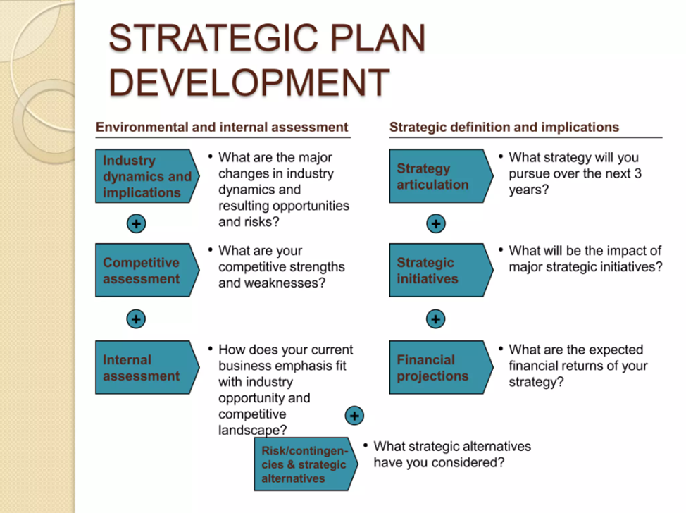
In the example below, the slide appears to be overloaded with different visual elements and colors.

8. Pixelated and Copyrighted Images
Adding images to presentations makes them look great, but not when they are pixelated or blurry. Instead of using images directly from your browser feed, stick to your photos or consider using stock images (many of which are free). This allows your presentation to stand out and does not make you look shabby.
While using images from the Internet, make sure to check for copyright issues and always be sure to credit the source of the image.
Remember to check the pixels of your images—nobody likes an image that is unclear or dismal. Make sure they are high-resolution images that can be seen from far away by your audience.
On this slide, the icons are too pixelated.

9. Repeating Content
Repeating information is one of the most common mistakes in drafting presentations. From facts, figures, and data to images, visuals, and graphs—even one repetition takes away the charm of the entire presentation.
Make sure to check and re-check your slides before finalizing them for your big day. Ensure that each point is unique in itself and have its sources checked.
10. Not Checking the Presentation Before Presenting
To avoid unpleasant surprises, view the presentation at the location where you will be presenting, using the same equipment that will be used during “show time”.
Make sure that the graphics and text appear neatly in the presentation, especially if you are using a computer different from your own. Make sure that the fonts appear on the displayed computer and that the colors are well-calibrated.
We hope these 10 common presentation mistakes highlighted above will guide you in creating your future presentations. The importance of an effective design in presentations must not be underestimated. To help you with your design efforts, you may wish to try Wonderslide to avoid these mistakes.