Nocturne presentation template
A quiet midnight-navy style with matte cards, thin edge accents and cool blue-violet highlights. Built for business reports, analytics and investor updates that need a serious, focused look and room for structured, text-rich slides.
Upload your PowerPoint or PDF and get it rebuilt in this style, with your content kept intact. Or describe a topic and start a new deck.
Use this style
🖼️ Slides in this style
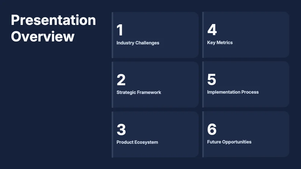




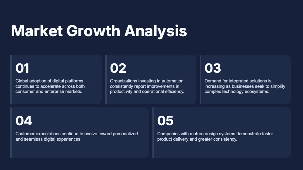
About this style
Nocturne uses a flat midnight-navy background with no decorative shapes, so the content carries the slide. Information sits in slightly lighter matte cards with rounded corners and a thin muted edge on the left side, arranged in tidy grids of two to six blocks. Titles are white, set in a neutral modern sans, with large numerals marking sections and steps. Color appears only in richer diagrams, where sky blue and soft violet mark phases, icons and pill-shaped labels on dotted timelines. Portraits sit in rounded frames over dark office and data-center scenes. The style suits business reports, market analyses, investor updates, tiered offers and internal strategy reviews. It handles text-heavy slides, numbered lists, comparisons, roadmaps and pricing well. It is less suited to bright, emotional or playful topics, and to rooms with very bright light, where a dark navy fill can feel heavy.
Questions and 💬 answers
Is Nocturne a good choice for text-heavy reports?
Yes, it is one of the better options for text. Matte cards group information into clear blocks, and white text on navy stays readable at modest sizes. Keep each card to two or three sentences, use numbered blocks to guide the eye, and put long supporting material in an appendix.
How is Nocturne different from other dark styles?
Nocturne is the most restrained of the dark options. It has no gradients, glow or neon accents, only flat navy, matte cards and cool blue-violet details. That makes it a better fit for serious reporting and client work, while livelier dark styles suit launches and creative pitches.
Does it work for diagrams and data visuals?
Yes. Roadmaps, comparisons and tier layouts use the blue and violet accents on the dark background, and icons stay clear. Charts should follow the same palette: light lines, soft blue and violet fills, and no heavy gridlines. Avoid dark gray or navy series, which blend into the background.
✨ Similar styles

Stone Minimal
A matte charcoal style with slightly lighter panels, clipped corners and soft grey type, with no accent color at all. Built for results reports, KPI reviews and strategy decks that need a sober, composed look.
- Pitch deck
- Business report
- Research

Mono Accent
A pure black style with dotted-outline cards and heavy white headlines, where color lives only in the photography. Suited to pitches, portfolios and brand decks that rely on striking black-and-white images with one red detail.
- Pitch deck
- Marketing
- Portfolio
Give your slides a new look
Try it for freeNocturneUse this style