Mono Accent presentation template
A pure black style with dotted-outline cards and heavy white headlines, where color lives only in the photography. Suited to pitches, portfolios and brand decks that rely on striking black-and-white images with one red detail.
Upload your PowerPoint or PDF and get it rebuilt in this style, with your content kept intact. Or describe a topic and start a new deck.
Use this style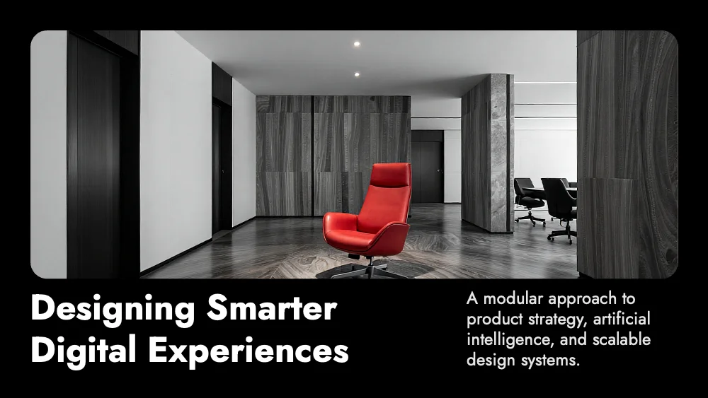
🖼️ Slides in this style





About this style
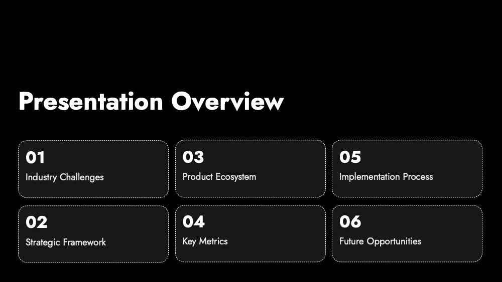
Mono Accent is built on a true black canvas, with no gradients or decorative shapes. Content sits in charcoal cards with rounded corners and a thin dotted white outline, like a stitched label, arranged in tidy grids of three, four or six blocks. Headlines are heavy, white and set in a geometric sans; quotes and statistics switch to light italic, centered on empty black. The interface itself carries no color, so any image or accent you add becomes the focal point of the slide. Photos have generously rounded corners, and portraits can overlap the top edge of their text cards. The style suits investor and brand pitches, design and architecture portfolios, strategy overviews and team introductions. It works best with short text, numbered agendas, phases and a few striking, high-contrast photographs, ideally with one vivid detail. It is less suited to colorful charts, long text passages and warm, friendly topics.
Questions and 💬 answers
Is Mono Accent a good choice for an investor pitch?
Yes. The black background and heavy headlines give a confident, premium first impression. The numbered agenda, phase cards and centered statistic slides cover the usual pitch structure, and the clean layout lets a single strong photo or number carry each key point.
Does it work for a conference talk in a large dark hall?
Yes. A dark slide causes little glare in a dim hall, and large white headlines stay readable from the back rows. The black field makes photos and key phrases stand out on a big screen, so the audience’s attention stays on the speaker’s main points.
Does it suit a luxury, fashion or automotive brand?
Yes. Deep black, heavy type and rounded photo frames feel premium and cinematic, which fits brands that sell through image and atmosphere. Generous empty space around each element adds a sense of exclusivity, and the quiet card interface leaves the photography as the main feature.
✨ Similar styles

Nocturne
A quiet midnight-navy style with matte cards, thin edge accents and cool blue-violet highlights. Built for business reports, analytics and investor updates that need a serious, focused look and room for structured, text-rich slides.
- Pitch deck
- Business report
- Research

Stone Minimal
A matte charcoal style with slightly lighter panels, clipped corners and soft grey type, with no accent color at all. Built for results reports, KPI reviews and strategy decks that need a sober, composed look.
- Pitch deck
- Business report
- Research
Give your slides a new look
Try it for freeMono AccentUse this style