Layer presentation template
A shape-first style built on cards with asymmetric rounded corners and a thick offset edge that creates a layered look. Fonts and colors adapt to your brand, so the same structure suits reports, trainings and client decks.
Upload your PowerPoint or PDF and get it rebuilt in this style, with your content kept intact. Or describe a topic and start a new deck.
Use this style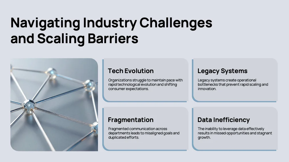
🖼️ Slides in this style
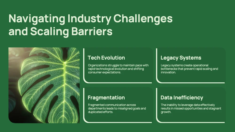
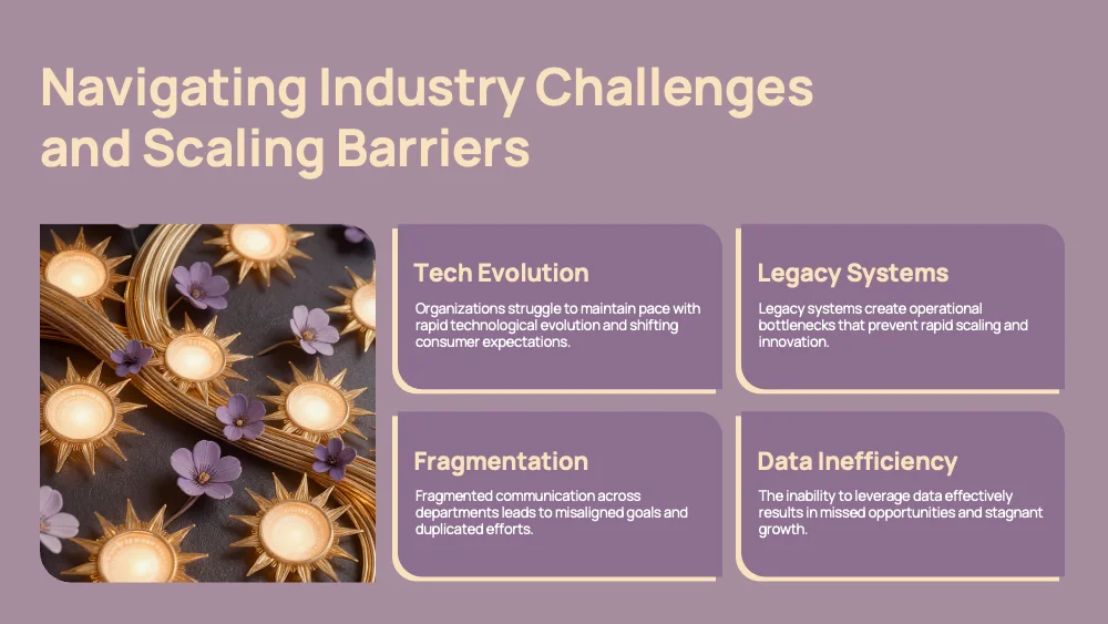
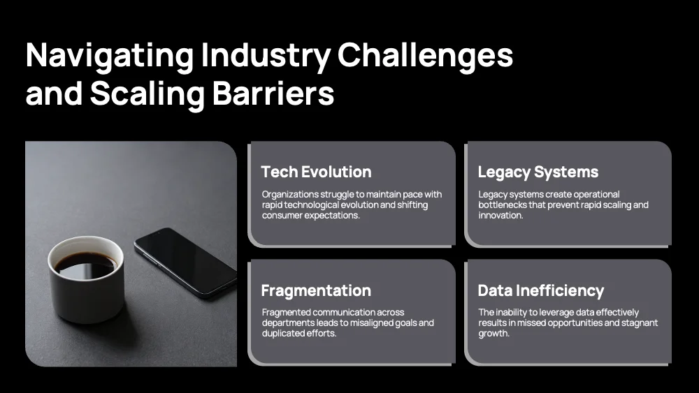
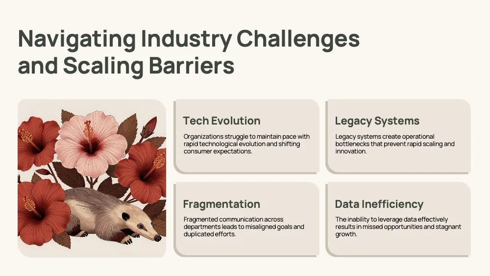
About this style
Layer is defined by shape, not by palette. Every content block is a card with unevenly rounded corners, large on one diagonal and tight on the other, backed by a thick offset edge along one side that makes the card look stacked on top of a second sheet. Cards arrange into tidy grids of two to six blocks, rows of numbered steps, or stacks of three beside a photo. Photos share the same asymmetric rounding, so images and text feel cut from one template. Large numerals mark order, and a winding path can connect phases on process slides. A wide rounded banner can open the deck, and a team slide pairs portrait cards with names and roles. Typefaces and colors are not fixed: they come from the user’s brand or chosen theme, while the forms stay constant. The style suits training, process explanations, case studies, reports and team introductions. It handles four to six parallel points, short descriptions and people photography well. It is less suited to long paragraphs and dense tables, where the generous card padding limits space.
Questions and 💬 answers
Does Layer keep its look when the colors change?
Yes. The recognizable look comes from the shapes: asymmetric rounded corners, the offset edge and the card grids. Because these stay the same, the style remains clearly itself with any palette, whether a brand color set or a chosen theme, and slides in one deck look consistent.
Does Layer follow my brand fonts?
Yes. Fonts are not part of the style: the shapes adapt to whichever typeface is applied, from a rounded humanist sans to a sharp geometric one. The card padding and numbered layouts keep text well framed, so the deck feels native to your brand.
Is Layer suitable for a training course?
Yes. Numbered cards, rows of four to six parallel points and winding process slides make steps easy to follow, and the layered cards give each module a clear frame. People photography fits naturally into the same rounded shapes, which keeps lessons approachable.
✨ Similar styles
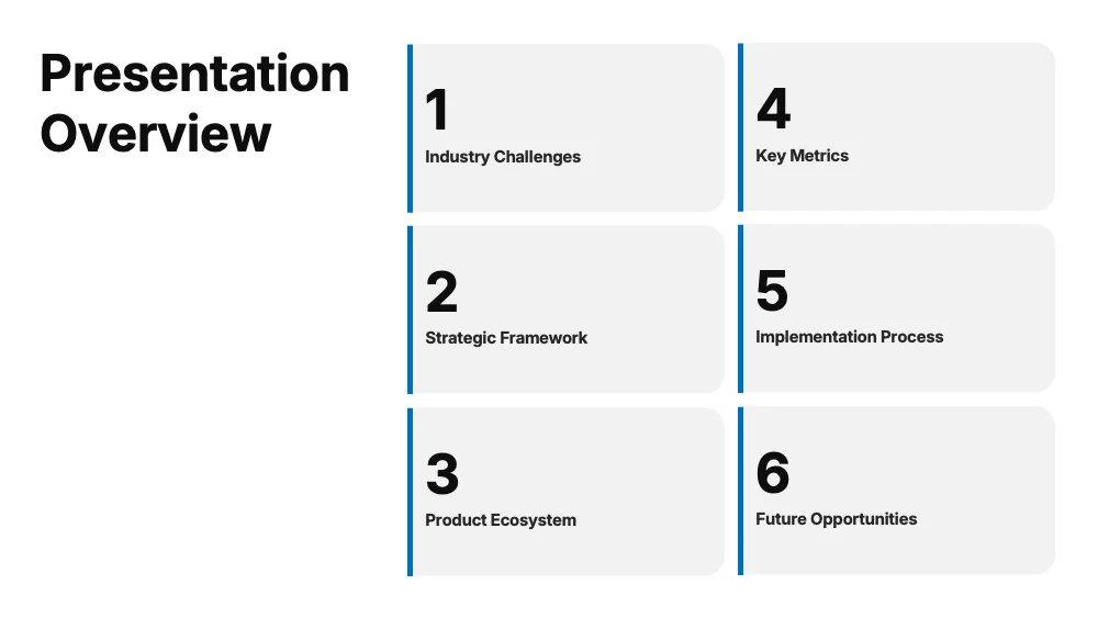
Flow
A soft-shape style built on rounded cards with a slim accent bar along one edge and generous padding. Colors and fonts adapt to your brand, so one calm structure suits reports, proposals and client presentations.
- Pitch deck
- Business report
- Marketing
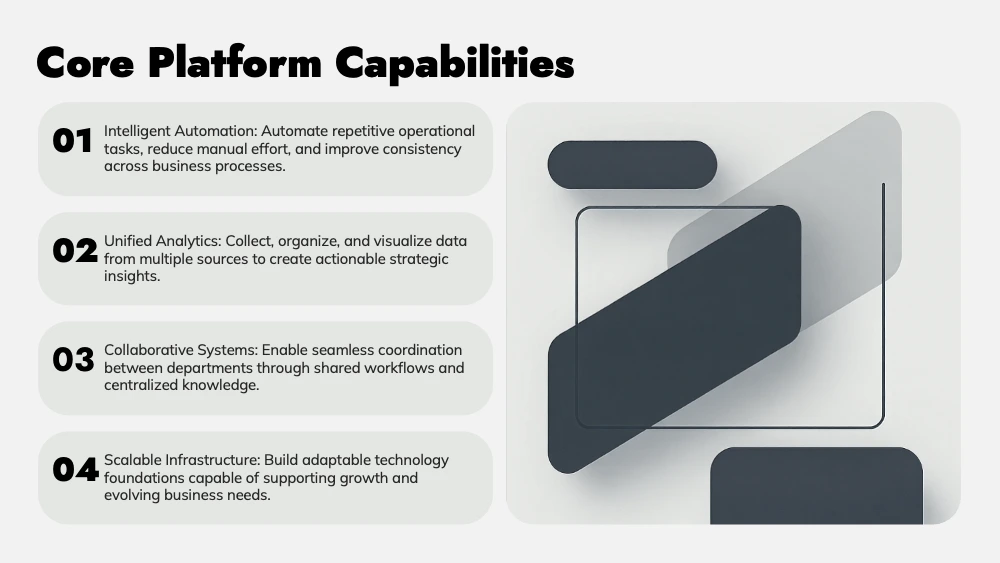
Contour
A style built on rounded plates that hold every block of content. Plates can be filled with one color or several contrasting ones, and fonts adapt to your brand, so one simple structure suits pitches, comparisons and product decks.
- Pitch deck
- Marketing
- Sales

Organic Flow
A warm cream style with sand-colored cards, sage, grey and terracotta edges, and softly rounded shapes. Suited to process-driven reports, trainings and case studies that should feel approachable, human and calm.
- Business report
- Training
- Marketing
Give your slides a new look
Try it for freeLayerUse this style