When OpenAI CEO Sam Altman posted on X about the aesthetic differences between their own keynote and the latest Google IO, it had prompted heated discussions, both on X and within our collective.
Some people instantly sided with Altman, while others poked fun, citing the apparent similarities between OpenAI’s presentation aesthetics and the interior of an average McDonald’s.
In any case, it got us thinking about how these companies approach their presentations, and what makes them so captivating. After all, one could argue that these keynotes are often crafted as meticulously as some of the products released by Apple and Google.
So today, let’s examine tech keynotes from a new perspective — focusing not on the products, but the presentations themselves. For the purposes of this article, we’ll be looking at Apple’s WWDC 2024 and the latest Google IO (sorry OpenAI, we still love you!). As you will see, there are stark differences between the two, but many key similarities as well. Understanding these similarities is extremely important if you are looking to take your public speaking to the next level, or simply improve your presentations going forward.
Intros
Apple: compared to WWDC 2023, in which Apple started with a reserved, if not slightly lethargic introduction by Tim Cook, in this year’s edition they’ve decided to go full “rock-and-roll”, with Craig Federighi and Co jumping out of a plane and onto the Apple Loop to the blazing guitar riffs of Mötley Crüe’s “Kickstart My Heart”. It’s a stark contrast to last year, bringing much more energy and excitement to the upcoming presentation.

Google: If Apple’s intro had music as background, Google IO started with music very much at the forefront of things. The company invited improv virtuoso Marc Rebillet, also known as “Loop Daddy”, to do what he does best — compose a track live, only this time with the help of Google’s new AI tool, MusicFX. Rebillet sampled a few AI-generated instruments onto his loop station, then played his synth live over them. It was an unusual introduction for a tech conference, however big props to Google for stepping way out of the box on this one — if anything, it was a lot more fun than what we usually get.
It was also a great showcase of how AI can help enable creativity rather than stifle it. For all the talk of AI being the “end” of artists and art as we know it, it’s good to see an example of what one can achieve when using AI as a companion tool, something to help enhance their writing process and open up new creative boundaries.

Conclusion? Both companies have gone with high-energy, slightly quirky intros this year. One lesson anyone can take from this is the importance of starting your presentation off on a lighter note, gripping the audience straight away and setting the right tone for what’s about to follow. Energy is also very important — it’s no coincidence that Rebillet appeared on stage in a gigantic coffee mug, or that Federighi’s stunt was accompanied by a rock song rather than a classical symphony. Boring your audience at the beginning of a 2+ hour presentation is a recipe for disaster, even if what follows meets all the criteria. Have some fun with it, and your audience will too.
Presentation Styles
Apple: While the image of Steve Jobs giving enigmatic presentations in front of a full Cupertino crowd still lives fresh in our memories, the style of WWDC has changed dramatically in the last years, especially post-COVID. Most notably, the main presentation isn’t being held in-person anymore — instead, what we get is a heavily-produced video presentation, complete with CGI transitions and a large number of videos.
However, when it comes to aesthetics, Apple’s ethos has largely stayed the same — beauty in simplicity. Minimalism has always been the cornerstone of Apple’s design language, and it shines through in their presentations just as well as their products. So, even though most of the presentation is filmed inside the Apple Loop offices, it never feels claustrophobic. There’s always ample amounts of ‘air’, which lets the viewer zero in on what’s being presented.
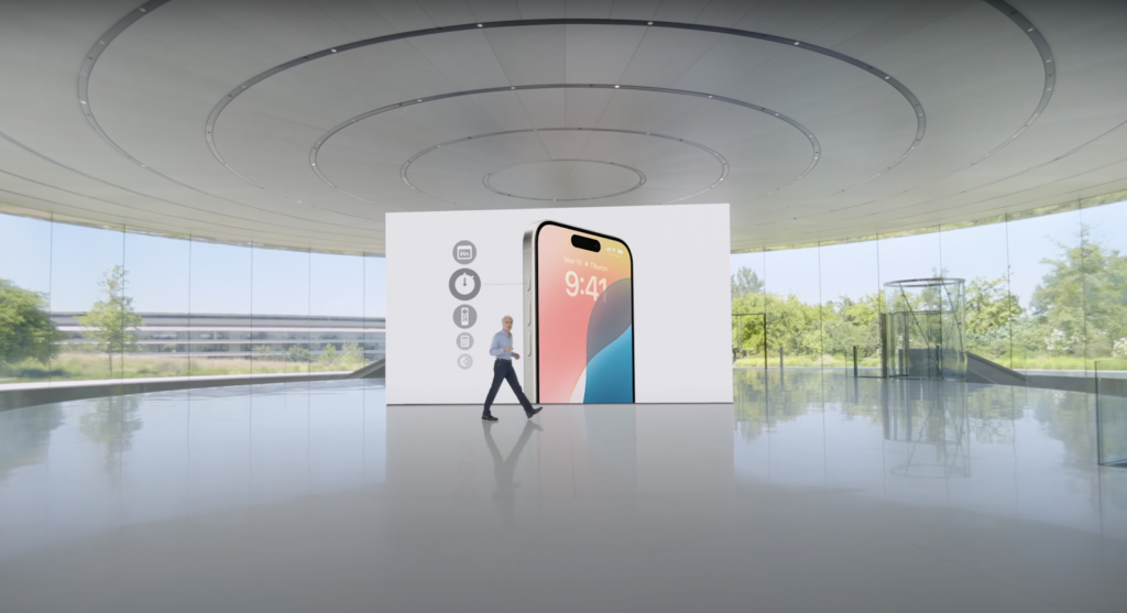
As we can see, nothing in the surrounding environment distracts us from the action — it’s actually quite the contrary. Notice how the ceiling patterns are almost pointing to Craig and the screen, not only creating a pleasant sense of symmetry, but also directing the viewer’s attention to what’s important. Or how the splash of green in the background adds life to what would otherwise be a fairly monotonous shot. Every little detail is thought through. Stylistically, Apple’s keynotes are very hard to beat.
But how does Google compare?
Google: the search giant’s presentation could also be described as stylistically minimal, but in its own unique way. First off, Google’s keynote was filmed live with hundreds of developers in the audience. As such, it could never have boasted the same level of visual meticulousness as Apple’s. But at the same time, there’s just something unique about the atmosphere of a live tech keynote that cannot be replicated by a video, however well-made.
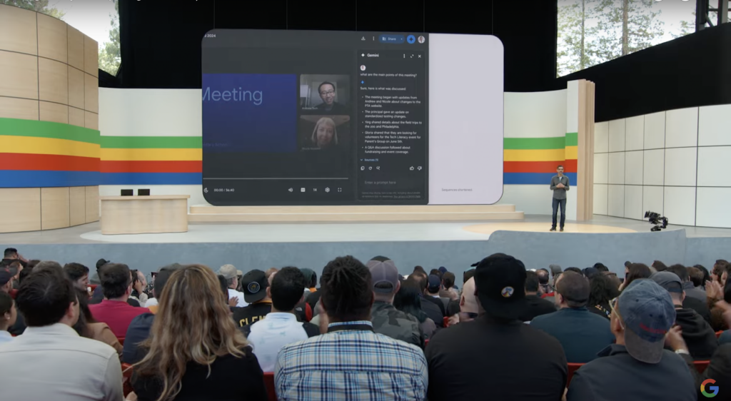
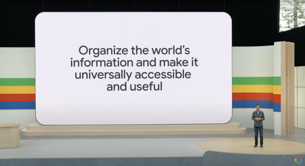
The stage is quite minimalistic, with some retro-like elements to it. But similarly to Apple, it is designed to keep the audience’s attention on the screen — there are no big visual distractions to be found. As you can probably tell by now, this is a recurring theme — it’s good practice to avoid any form of unnecessary clutter that could potentially steal the viewer’s attention.
Google’s rainbow in the background is an example of yet another, more subtle similarity between the two presentations — the use of color to freshen up an otherwise “boring” shot. Both companies prefer a rather conservative color palette for their keynotes, which is why it’s essential to add a splash of color in the background. It’s a key design technique that makes things much more easy on the eyes, and something you can easily incorporate in your own presentations.
Another thing to note is that the companies’ different presentation styles actually say a lot about their respective philosophies. Apple was (almost) always known for having a closed, tightly-controlled ecosystem of software and hardware. This level of control is a big reason for the success of their products, no doubt, but it’s also the reason why a large number of “power users” gravitate towards Android — which is open-source, highly customizable and generally gives the user much more freedom to tinker with the OS.
This fundamental difference in approach is evident in the presentations themselves — Apple’s being meticulously crafted and produced, but closed off. Thoroughly controlled. Almost perfect by every observable metric, but nearly to a point of becoming “sterile”. Google’s, meanwhile, was more quirky (what can be quirkier than Loop Daddy playing an experimental, high-energy set in front of a crowd of sleepy, mostly-uninterested developers?) and certainly less polished, but the crowd made it feel more open and inviting.
Slide Design
When it comes to the actual slides, there are more similarities than differences, so there’s no reason to look at them separately. Both Apple and Google are extremely minimalistic when it comes to the design of their slides, with Google’s having slightly more complexity. But in this case, complex doesn’t always equal better — in fact it’s very much the opposite.
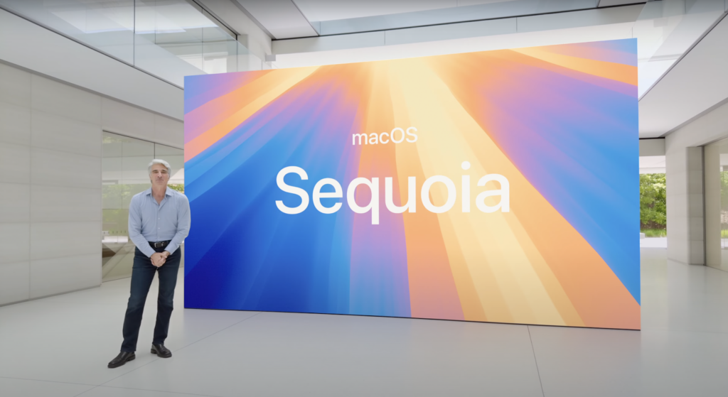
Both companies understand very well the extreme importance of not overpopulating the slide with unnecessary clutter. Apple’s slides are especially no-nonsense — big, bold text, simple fonts, simple white background. The slide here isn’t meant to attract any extra attention, it’s only there to provide context to what the speaker is currently saying.
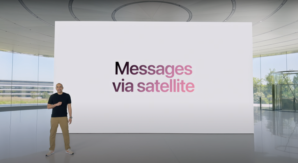
However, both Apple and Google sometimes spruce things up with more colorful or complex images. Usually, it’s when they want the slide to have more impact, such as when announcing a new product or OS. That’s another advantage of simple, minimalist slides — they allow for more contrast play, so the few important slides that do have color instantly pop and grab the viewer’s attention.
Conclusion
Google and Apple, while certainly having their own unique styles, both understand one very important concept — the power of simplicity. At first glance, their presentations are visually unassuming, but there is a clear underlying purpose to that. That purpose: don’t stand in the way of your own storytelling. The audience isn’t there to revel at the impeccable design of your slides, it’s there to learn new and exciting things. The presentation, the slides — all of it is nothing more than a vehicle for information, and a vehicle tends to be fastest when light and devoid of clutter.
But there’s much more to making amazing presentations. For additional tips and tricks, check out our latest data-driven guide on making more effective slides. Who knows, maybe someday it will be you on the stage presenting the next big thing in tech? Never hurts to be prepared.
So, what are your thoughts on the latest keynotes? Do you prefer the vibe of Google’s open, live presentation or the sleek, high-budget style of Apple? Hit us up on X, we’d love to know your opinions. And, as always, stay tuned!