Blue Aura presentation template
A saturated royal-blue style with soft organic blobs, alternating with calm pale-blue slides. Suited to product, technology and consulting decks that need a strong opening, big statistics and a clear step-by-step structure.
Upload your PowerPoint or PDF and get it rebuilt in this style, with your content kept intact. Or describe a topic and start a new deck.
Use this style
🖼️ Slides in this style




About this style
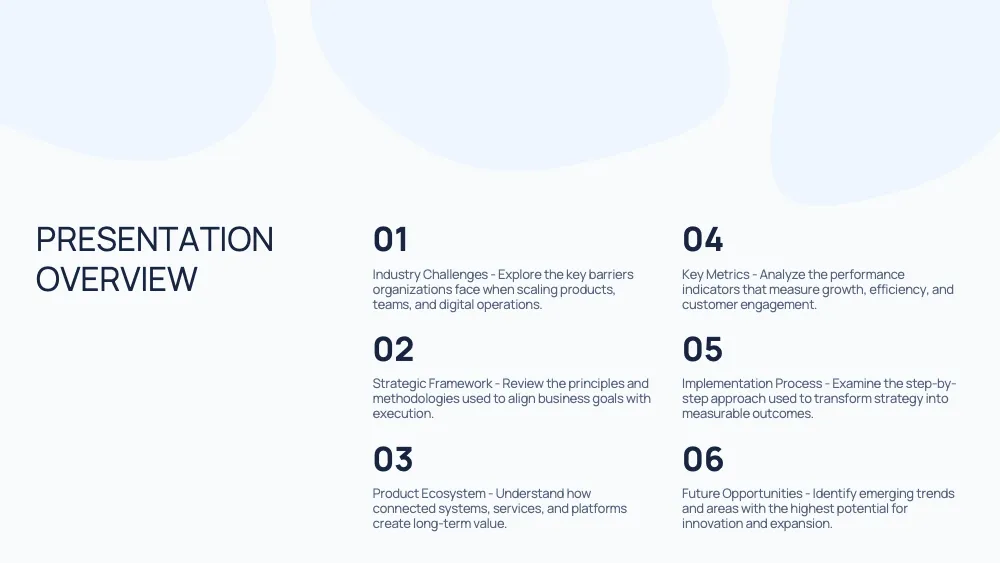
Blue Aura alternates two moods. Cover, statistic and closing slides use a saturated royal blue with white type and large, tone-on-tone organic blobs, while content slides switch to a near-white pale blue with the same soft shapes and dark navy text. Headlines are set in a clean geometric sans, bold on blue and light uppercase on white, and key figures can grow to full-slide size. The style fits product strategy, technology and consulting decks, investor pitches and project plans. It works best with one big number, short headings, process steps and cool, muted photography. It is a weaker fit for long paragraphs, wide tables or warm, playful topics, where the strong blue and rounded organic shapes feel too formal or too heavy.
Questions and 💬 answers
Is Blue Aura good for an investor pitch?
Yes. The blue cover and closing slides give a strong first and last impression, and the statistic layout puts one key figure on a full screen. Add the roadmap and team slides for structure and credibility. Keep each slide to one message so the large shapes never compete with the text.
What kind of photos work best?
Cool, muted photos with plenty of negative space, such as interiors, architecture, still life or portraits against a plain wall, blend naturally with the blue palette. Rounded corners and a full-height split layout frame them well. Very warm, saturated or cluttered images compete with the blue background and are better placed on light slides.
✨ Similar styles

Soft Aurora
A deep indigo-to-violet gradient that slowly shifts behind frosted glass cards and glowing icons. Made for product launches, platform demos and pricing slides that should feel futuristic and polished without losing readability.
- Pitch deck
- Marketing
- Sales

Black Neon
A pure black style with acid-lime accents and bold white type. Cards alternate in lime, white and outlined black, giving pitches, product comparisons and marketing decks high contrast and a confident, energetic character.
- Pitch deck
- Marketing
- Sales
Give your slides a new look
Try it for freeBlue AuraUse this style