Architecture is not just about constructing physical spaces; it’s about telling a story through design. One of the most powerful tools architects use to communicate their ideas is a presentation board. These boards serve as a visual narrative, helping to convey the concept, development, and final vision of a project.
But how do these boards go beyond just showcasing images and plans? How do they shape and define the story of a design? In this article, we’ll explore how architecture presentation boards help tell a design narrative and the techniques that ensure creative ideas are effectively communicated.
The Importance of a Story
A presentation board is a visual storytelling tool that guides the viewer through the design process.
Whether the board is part of a proposal, competition submission, or final presentation, it serves as a medium through which the architect can engage the audience, explain the design concept, and show the project evolution.
The narrative formed by the presentation board should be clear and coherent, allowing viewers to follow the architectural journey from the initial idea to the final design.
Without this narrative, the board risks becoming a static collection of plans, sketches, and renderings that can’t capture the essence of the project. A strong narrative ensures that the design isn’t just seen, but understood and appreciated.
Key Elements of the Architectural Narrative
An architectural narrative on a presentation board includes several important elements that together tell the full story of the design:
1. Visual Journey
The visual journey guides the viewer through the project’s concept and evolution. This might involve using a sequence of images or sketches that depict different stages of the design process—from early conceptual sketches to more refined renderings and plans.
The idea is to give the audience a sense of how the project evolved over time. Showing how ideas transformed during the project’s development gives context to the final design.
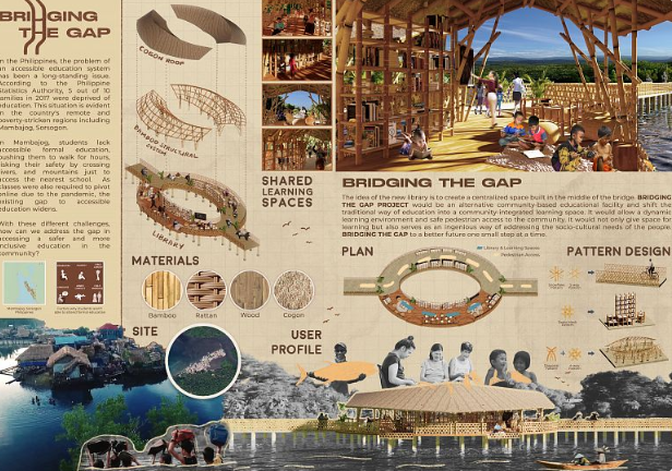
Here’s a project called “Bridging the Gap” (Philippines). It’s a library located on the bridge that serves as an educational facility. The architect, Zion Enrico Licup, shows on his board how his inspiration by the idea of providing accessible education for remote areas transformed a bridge connecting two river banks into the bridge to knowledge and culture.
2. Diagrams and Visual Analysis
Diagrams are crucial for explaining how a design works functionally and spatially. They can show how the spaces are organized, how circulation flows, or how the building responds to its environment. An essential part of the story.
These visual tools help simplify complex concepts and make the project’s functionality and intent easier to understand.
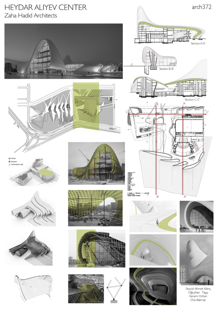
Here’s a project for a multipurpose hall called Heydar Aliyev Center in Baku (Azerbaijan), created by a world-renowned architect Zaha Hadid. She provides detailed diagrams explaining in simple terms complicated construction of the impressive building.
3. Images and Renderings
High-quality images and renderings bring the final design to life. These should reflect the architect’s vision, highlighting key features of the design. The use of perspective views or realistic renderings can immerse the viewer in the design and convey the atmosphere and experience of the space.
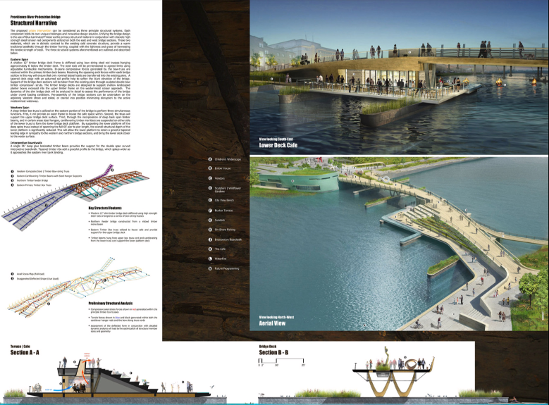
The example below shows the project of the Providence Pedestrian Bridge (USA). This project took part in the competition for the best design. Its architecture board uses mostly high quality 3D visuals that create a beautiful narrative and bring the concept to life.
Visual Communication Techniques in Architectural Boards
Creating an effective architectural presentation board requires understanding of how visual elements communicate information. Here are some key visual communication techniques that architects use on their boards to tell their stories:
Graphic Hierarchy: Graphic hierarchy refers to the way elements are arranged to guide the viewer’s attention. It’s about controlling the order in which the viewer looks at different aspects of the design.
Important information, such as the overall design concept or key diagrams, should be more prominent, while secondary elements, like smaller images, should be less visually dominant. The hierarchy helps ensure the viewer engages with the most important aspects of the design first.
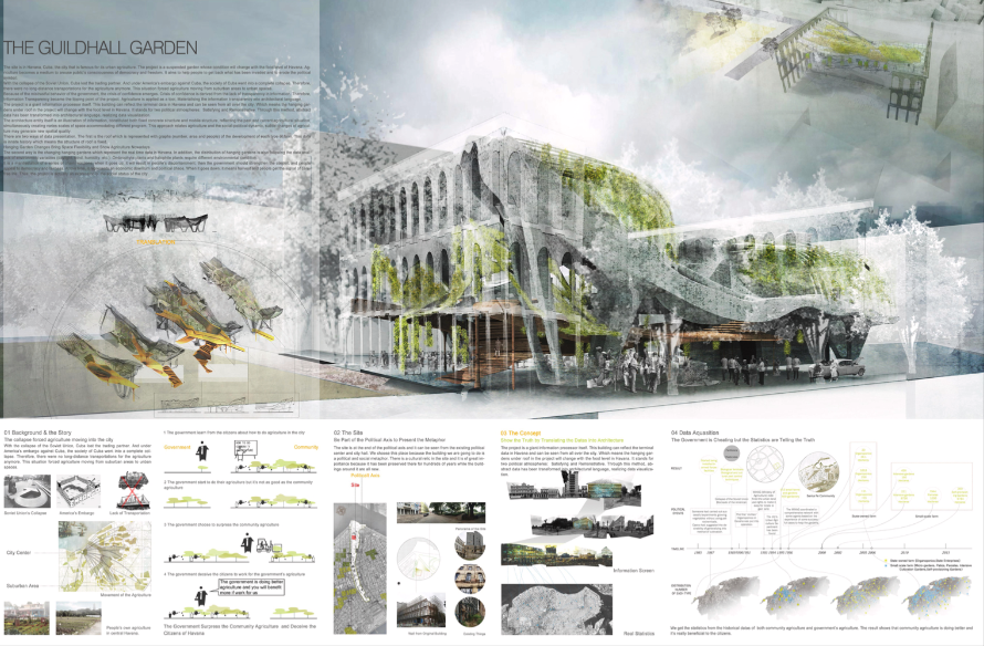
The project below is the 3d prize winner of the 3D Nature Systems competition in New York (USA), where architects and designers created ecologically-grounded sustainable designs. The project is called “Guildhall Garden.”
You can see how skillfully graphic hierarchy is used here, an impressive central construction of the project playing the main role.
The text and more specific imagery and diagrams have sufficient space and support the architectural narrative, but there’s no doubt where the audience is going to look at first.
Color and Contrast: Color plays a significant role in communicating mood and emphasizing certain aspects of the design. Architects often use a limited color palette to avoid overwhelming the viewer. They choose colors that align with the building’s purpose or the materials used in the design.
Contrast between light and dark areas can help highlight important features and create visual interest. A balanced use of color and contrast ensures that the board is visually appealing and easy to read.
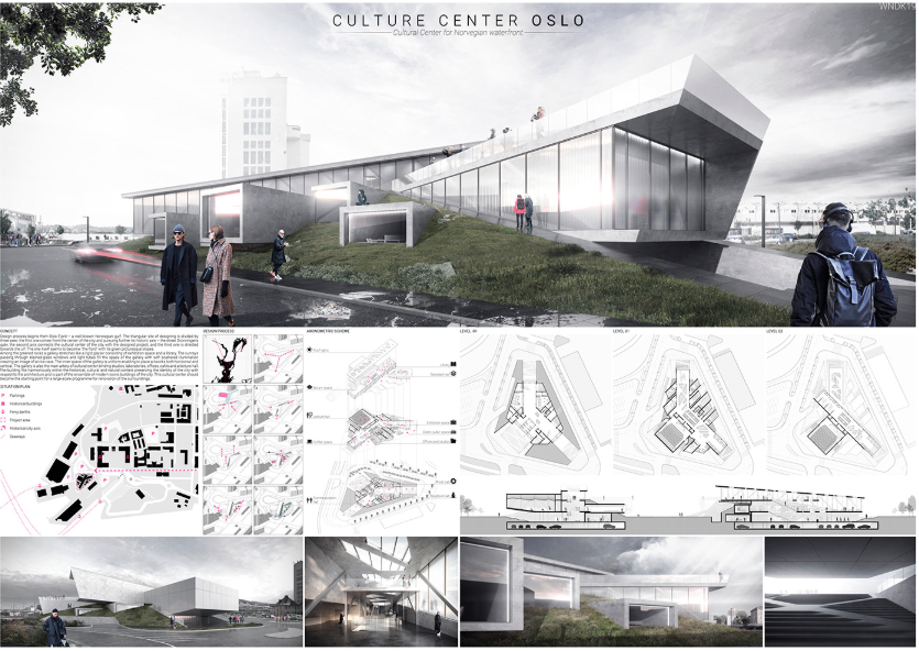
Here’s a board for the project of the Oslo Culture Center created by Timur Rozakov, which is done in soft neutral colors, mostly grey, resembling the grey skies of the Norwegian capital. Very stylish.
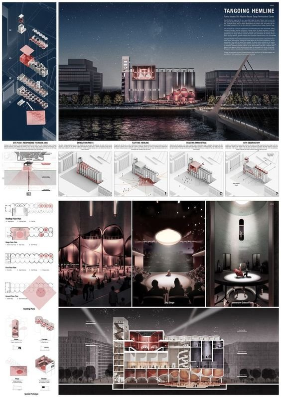
And another example, where contrast helps highlight certain areas architects want the audience’s attention first.
It’s a project for TerraViva Competitions in Buenos Aires, and it’s called “Tangoing Hemline”.
Typography and Text: Text is another critical element of the presentation board. It can provide explanations, labels, and annotations that clarify the design intent.
However, the typefaces and fonts should be legible and complement the design rather than distract from it.
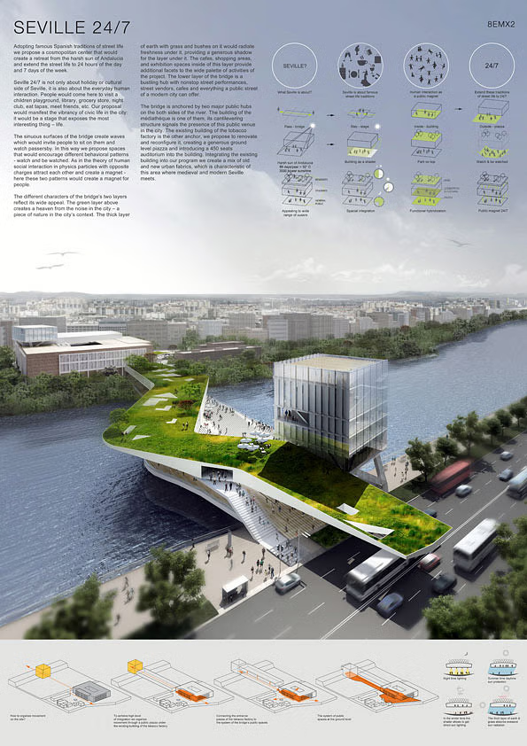
Here’s a winning project of the competition for the design of a bridge in Seville (Spain). Well-chosen typography helps maintain the visual flow of the board, where the text is seamlessly incorporated without standing out.
Spacing and Layout: The layout of a presentation board should be clean and organized. Proper spacing between elements allows each component to “breathe,” making it easier for the viewer to follow the story.
A cluttered board can overwhelm the viewer and make it difficult to focus on key aspects of the design.
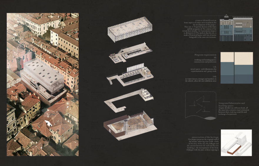
An example of excellent spacing and layout: the board of an Artisan School project (Venice, Italy). The project team included Lucas Fukuda, Octavio Mendes and Thomaz Yuji Baba.
Challenges in Creating a Comprehensive Narrative
While creating a compelling architectural narrative through a presentation board is crucial, it is not without its challenges. Some of the most common difficulties include:
1. Balancing Visuals and Text
One of the biggest challenges is finding the right balance between visuals and text.
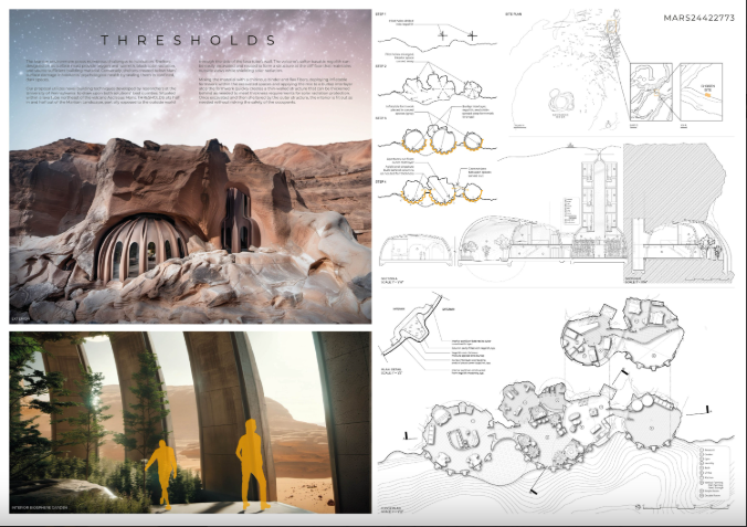
Here’s an example of a balanced architectural board. The project participated in the Volume Zero Competition, where the architects were invited to create a self-sustainable living habitat on Mars.
The concept of the competition is designing a utopian future. For such projects, creating a narrative is absolutely paramount because the architect presents their unique vision of the future and has to explain it.
The amount of text and imagery is very well-curated here; the text doesn’t overwhelm the board but provides a necessary context.
2. Clarity in Conceptualizing Complex Ideas
Translating complex architectural ideas into easily understandable visuals is another challenge. Concepts like spatial relationships, circulation, or environmental considerations can be abstract and hard to represent visually.
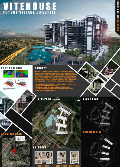
Using clear diagrams, simplified drawings, and step-by-step visuals can help bridge this gap, like it’s displayed on this board for a future village project presented at the GREENTECH competition.
3. Coherence Across Multiple Boards
In large projects or competitions, architects may need to create several presentation boards. Maintaining a consistent visual language and narrative across all the boards is essential for clarity and cohesion.
Each board should feel like part of a unified story rather than a collection of disconnected elements.
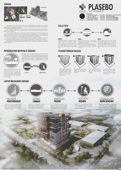
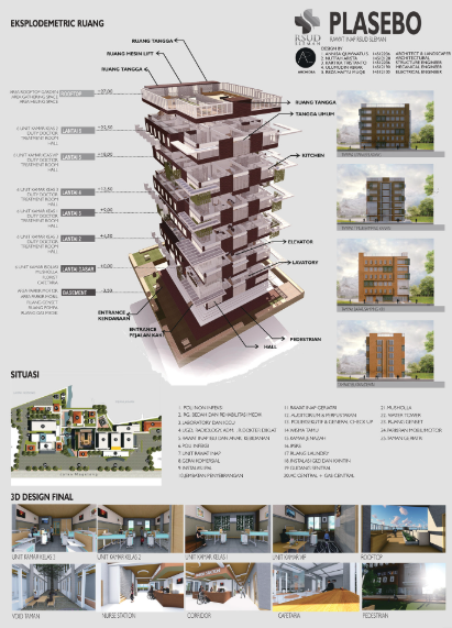
Here’s a project for a multi-storied residential building designed by an architect Annisa Syakhsyiyah. It’s an extensive project, so there is more than one board, but you can see undeniable consistency and cohesion between them contributing to the overall harmonic vision.
Final Thoughts
Architecture presentation boards are storytelling tools that help architects communicate their design concepts, processes, and visions.
Each element, from the development of the design concept to its functional analysis and final visual representation, plays a role in telling the complete story.
Visual communication techniques require skill and experience, therefore, a beautiful and effective architecture board is worth recognition and appreciation.
Creating classical slides is easier but still takes a lot of time. We can save it for you and offer assistance in crafting an outstanding architecture presentation with our fast and capable slide maker. It’s AI-powered and highly efficient; you will have excellent, professionally-looking slides in no time.
By mastering the art of storytelling, architects ensure their work leaves a lasting impact as remarkable ideas born in the architects’ imagination come to life.