How often do you come across presentations that are overflowing with canvases of meaningless text? Presentations are needed to visualize the speaker’s presentation and make it more visual by supporting the report with pictures, not to make you fall asleep. How to choose and create the right text for a presentation, we will tell you in this article.
1. Start with a clear main idea
Every presentation should have a core message that you want to get to your audience. Before you start developing your design and content, identify one key idea that will encapsulate the entire presentation. Your core idea will be the “Polaris” that guides all aspects of the presentation.

2. Matching the clarity of the text to the audience
KISS, the timeless acronym for “Keep It Simple, Stupid,” is your best friend in creating presentations. Simplicity and clarity go hand in hand. Your presentation should be simple and clear. Avoid complicated wording and the concepts that can confuse your audience. The goal? If a six-year-old can understand your message, you’re on the right track.
3. Don’t forget about PREP
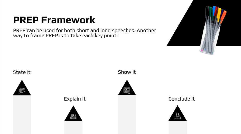
Use the PREP framework to create a structured and persuasive presentation. It stands for Point, Reason, Example, Point. Start with a clearly articulated thesis that you want to convey to your audience. Justify its importance, give real-life examples to illustrate it, and then follow it through with a restatement. This systematic approach ensures that your content is logically constructed and captures your audience’s attention.

4. Structure it
Overloading your audience with a wall of text is a sure way to lose their interest. When giving a presentation, aim to deliver information in a concise manner. Instead of filling slides with paragraphs, use bullet points and headings to convey main ideas. And detailed explanations are best given verbally, engaging the audience in conversation rather than reading.
5. Creating compelling stories
Storytelling is a formidable presentation tool. Stories make information accessible and memorable. Include stories in your presentation to illustrate key points. Whether it’s a personal anecdote or a specific example, stories create a connection and make it easy for the audience to remember and understand your message.
6. Keep it shorter
Clarity and brevity are inseparable companions. Use short and clear sentences to convey your ideas. Long paragraphs can overwhelm your audience and should be avoided. Remember the golden rule of “one thought per slide.” This not only simplifies the text, but also focuses attention on each slide.

7. Avoid jargon
If your audience is not familiar with specialized terminology, avoid jargon and overly technical terms. Speak in plain and simple language. If you have to use jargon, give clear explanations so that everyone understands the meaning of your message.

8. Text alignment matters
Text alignment has a significant impact on readability. The most common and easy to read option is left-aligning text. Center-aligned text should be used infrequently, mostly for slide titles. Right-aligned text can be difficult to read, so it is usually avoided. Alignment should be chosen according to the specifics of the content.
9. Proofreading for perfection
In the battle for clarity, typos and grammatical errors are your enemies. You can enlist the help of a colleague or use proofreading programs such as Grammarly to make sure your text is flawless.
10. Clarity over complexity
One more time. Clarity should take precedence over complexity in presentation text. Also, it serves as an informational and motivational element, devoid of unnecessary descriptions and details. Stick to dry, clear facts that support your point of view. Emotions and well-chosen epithets can add zest, but don’t overdo it. Balance is the key to keeping your audience interested.
If you follow these principles, your presentations will cut through the noise and resonate with your audience. By the way, we’ve talked about how to create a better presentation in the past article. Stylish and functional design, on the other hand, will be taken care of by Wonderslide.