Creating an impactful presentation isn’t just about the content — visuals play a major role, too. We’ve all sat through slides that felt dull or confusing, and more often than not, the issue comes down to one thing: poor design.
Fonts and colors might seem like small details, but they can completely shape how your message is received. Today, AI tools are making it easier to get those details right, helping you create professional-looking slides that also stay true to your brand.
Let’s explore why fonts and colors are so important, how they connect to brand consistency, and which AI tools are leading the way — especially when time is tight and quality matters.
However, don’t forget about the importance of the content. Check out our article on using AI (ChatGPT) to create effective and memorable presentations.
Why Fonts and Colors Matter
Imagine receiving two different presentations from the same company. One uses a playful font in bright neon colors, and the other opts for a modern, minimal look in calm blues and greys.
Would you guess they came from the same brand? Probably not — and that’s the problem.
Fonts and colors communicate more than just visual appeal. They send subconscious signals about your company’s personality, professionalism, and attention to detail. For example:
- Serif fonts (like Times New Roman) often feel traditional and formal.
- Sans-serif fonts (like Helvetica or Arial) are cleaner and more modern.
- Warm colors like red and orange can evoke energy or urgency.
- Cool tones like blue and green often feel calm, trustworthy, or innovative.
Even if your message is strong, mismatched fonts and colors can distract or confuse your audience.
On the flip side, when these elements are used intentionally, they enhance the message and strengthen your brand identity.
Fonts, Colors, and Brand Consistency
Brand consistency means that everything your company produces — presentations, websites, emails, social media — looks and feels like it comes from the same source. This isn’t just about aesthetics; it builds trust.
When your audience sees consistent colors and fonts, they recognize your brand instantly. It creates a sense of familiarity, reliability, and professionalism.
Just think about big brands like Coca-Cola, Google, or Apple. Their design choices are so consistent that you can recognize their branding even with the logo removed.

In presentations, using your brand’s fonts and color palette helps reinforce that identity. It ties your message to your company’s overall image and ensures you’re not sending mixed signals.
Benefits of Consistency
So consistent fonts and colors bring some significant practical benefits:
- Recognition: Your audience quickly associates visual elements with your brand.
- Professionalism: Well-designed, cohesive slides reflect attention to detail.
- Clarity: Uniform styles reduce distractions and make your content easier to follow.
- Efficiency: With brand assets in place, creating new presentations takes less time.
These small design choices can make a big impact whether you’re pitching to investors, training new employees, or presenting to clients.
Fonts and colors set the stage, but it’s your story that brings the slide to life. Discover how AI can help craft that story – read our guide on AI-powered storytelling in presentations.
How AI Can Help
Let’s be honest — not everyone is a designer. That’s where AI comes in.
AI tools today can automatically select the right fonts, adjust color schemes, and design entire presentations in minutes. They’re perfect for professionals who want beautiful, brand-aligned slides without hiring a designer or spending hours in PowerPoint.
Here are a few tools that will make effective assistants in a presentation crafting process:
Wonderslide
Wonderslide uses AI to instantly redesign your slides based on the content and brand. Upload your PowerPoint draft, and it applies your brand’s fonts, colors, and layout preferences to create stunning, cohesive designs.
If you select the company color, font, and logo, the AI tool will choose the best design for your presentation.
Best for: Busy professionals and teams who need polished, on-brand presentations fast without design skills.
Beautiful.ai
This smart presentation tool helps you create visually consistent slides by automatically adjusting layouts and applying themes. It also allows you to lock in brand styles, so every presentation your team creates stays on-brand.
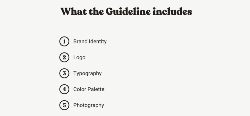
Here’s the Brand Guidance template that helps companies create their unique brand style.

Best for: Marketing and sales teams that want stylish presentations with minimal effort and full brand control.
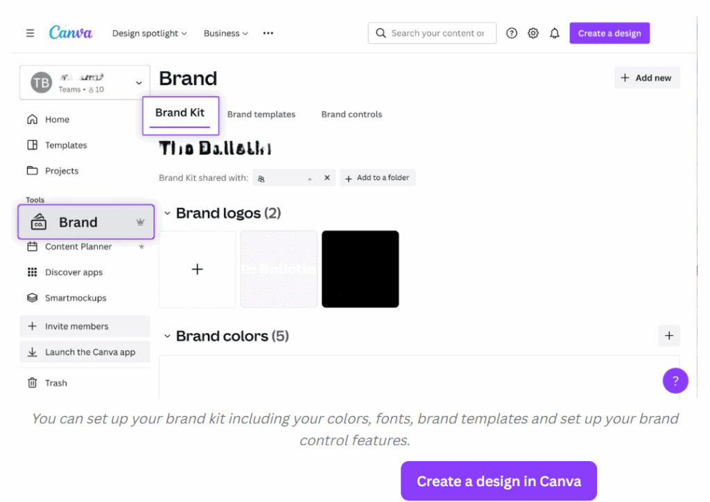
Canva
Canva is a graphic design platform that uses AI tools, offers smart suggestions and templates, plus a Brand Kit where you can upload your logo, fonts, and colors. It’s easy to use and great for small businesses or freelancers.
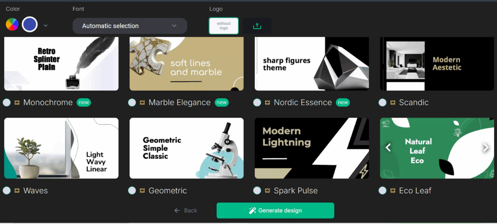
Here’s an example of how a Brand Kit is created:
Best for: Small businesses, freelancers, and non-designers looking for a versatile, all-in-one design platform.
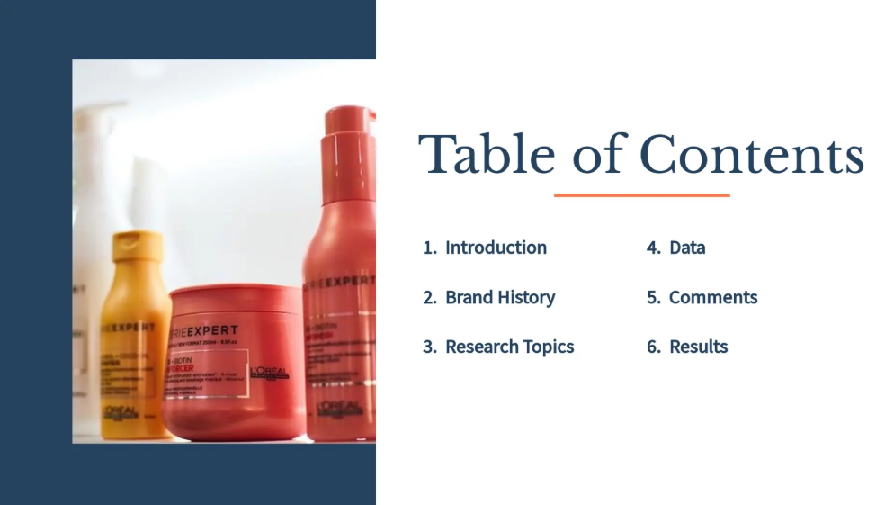
Decktopus
This AI-powered platform helps users generate slide content and visuals based on a topic or bullet points. It also supports brand themes and layouts to maintain consistency across decks.
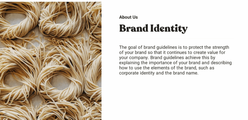
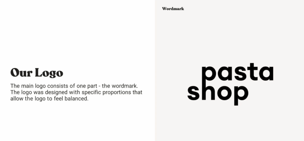
Here’s an example of the Case Study presentation featuring consistent and visually appealing font, color, and style combination:

Best for: Educators, consultants, and content creators who want help with both structure and visual style.
Final Thoughts
Fonts and colors aren’t just parts of a pretty picture — they’re tools that shape how people perceive your message. When used consistently, they strengthen your brand and make presentations look polished and professional. And with AI tools, achieving that level of consistency is easy.
These tools can save time and elevate your presentation game for a seasoned marketer, a busy executive, or just someone who wants their slides to look amazing.
So next time you’re putting together a deck, don’t overlook those fonts and colors — they might be the key to making your message stick.