In the past few decades, the way we give presentations has transformed dramatically. A straightforward information delivery with bullet points and text-heavy slides has evolved into an engaging, visually captivating, and often fun experience.
We thought it would be interesting to dig up what has influenced this substantial shift and redefined what it means to give a presentation.
Let’s explore how the following developments in our lives have shaped the way we present today.
1. The TED Talk Revolution: Presentations as Performances
We don’t think that TED Talks’ founders realized how profound the effect of their startup would be on society in general and on the concept of a modern presentation in particular.
TED Talks transformed presentations into performances. These 18-minute talks put forward the power of narrative, making complex ideas accessible and engaging.
We ‘blame’ TED Talks for making storytelling a cornerstone of effective presentations, with many companies embracing this approach to make their messages more relatable and memorable.
Example: One of the most famous TED Talks of all time is Ken Robinson’s “Do Schools Kill Creativity?” Robinson delivers his presentation as if it were a heart-to-heart conversation with friends.

He uses humor and anecdotes to discuss serious educational issues. The whole talk is a master class in storytelling skills. Sir Ken’s approach set a benchmark for how to engage an audience through a compelling narrative.
In our blog, there is another article on the transcendent meaning of TED Talks and storytelling skills, citing the most outstanding presentations. Check it out.
2. Design and Simplicity: Apple Legacy
Apple, under Steve Jobs, revolutionized presentation design with a minimalist approach that prioritized simplicity and visual appeal. Jobs’ presentations are often cited as the gold standard for effective communication.
Example: A classic example is the introduction of the 2007 iPhone by Steve Jobs. During this keynote, Jobs used slides with minimal text, often just a single word or image, allowing the product to be the hero of the story.
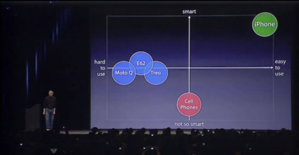
This presentation became a trendsetter, demonstrating that a few well-chosen visuals combined with a strong narrative could be far more impactful than cluttered slides.
It should be noted that Apple continues to use the same approach in presentations after its legendary founder passed.
In our blog, we have an article exploring the current features of Apple’s product presentations. The article also compares Apple’s approach to the approach of its competitor Google. Check it out, it’s a fun read.
3. The Visual Turn: Images and Graphics Over Text
The shift towards visual content in presentations reflects a broader understanding of how people process information. Companies began to realize that images and graphics could deliver messages more effectively than text-heavy slides.
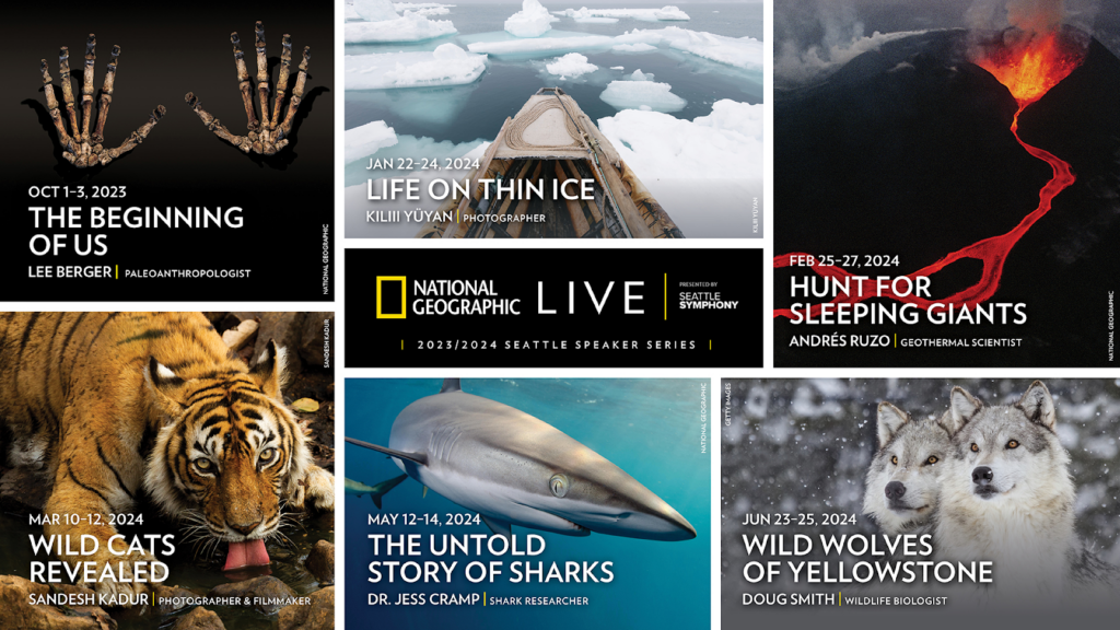
Examples: National Geographic is a leader in using powerful imagery to tell stories. In their presentations, they often use stunning photos to catch the audience’s attention and communicate their message.
Here are the striking images they used for a Seatle live presentation.
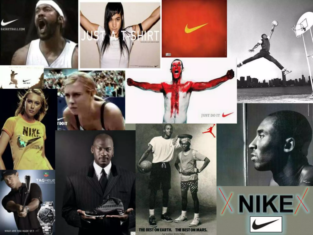
Another good example is Nike, particularly during the launch of their innovative products. Nike presentations are known for their strong visual focus, with slides often featuring bold images of athletes in action, accompanied by just a few powerful words.
This strategy not only showcases the product but also connects emotionally with the audience. The highlights of Nike’s brand message are empowerment and achievement.
4. Interactive and Engaging Content
Technological breakthroughs led to interactivity becoming a key component of modern presentations by helping to excite audiences and keep them involved.
Salesforce, a US cloud-based software company, has been one of the pioneers in using interactive content during their annual Dreamforce conferences.
They started incorporating live demos, audience polls, and real-time Q&A sessions into their presentations.
Example: During the presentation on their Einstein AI platform, Salesforce used live demonstrations and invited audience members to share their experiences. This not only showcased the platform’s impressive potential but also kept the audience actively engaged.
5. The Influence of Social Media and Online Platforms
Presentations today are often designed with online sharing in mind, leading to the creation of content that is informative, easily digestible, and shareable.
Presentations found their way to social media platforms and fit right in as, for example, Instagram stories or LinkedIn carousels.
Content creators on these platforms use the same principles as the ones applied to crafting presentations.
We have a couple of articles about using presentation format in social media: one on Instagram Stories and one on LinkedIn Carousels. Check them out.
Example: One of the iconic examples of the presentations and social media synergy is a Heinz LinkedIn carousel published to prevent restaurants from filling the Heinz bottles with lower-quality, cheaper ketchup.
This carousel is a true presentation with concise, impactful statements and clear visuals that are perfect for sharing on LinkedIn.



The whole world is going mobile, and the format of social media platforms naturally reflects that which, in turn, has led to vertical presentations becoming more popular. You can read about vertical presentations here.
Final Thoughts
The way we give presentations has evolved dramatically, influenced by pioneers like TED Talks, Apple, and various other leaders who have set new standards for visual design, storytelling, and audience engagement.
Minimalist elegance, narrative power, inclusion of interactivity, and seamless integration with social media—all these trends have reshaped how we communicate ideas.
We at Wonderslide believe in embracing positive changes. We know that by doing so we are arming our AI designer with the best and most effective tools, making sure that you’ll get a state-of-the-art presentation as a result.